More and more people are using smartphones - instead of desktop computers - to browse the web, and as mobile internet usage increases, so too does the amount of money spent online via mobile. In fact, shopping is one of the most common things that people do with their phones nowadays; this Econsultancy report suggests that 24% of mobile internet users have made purchases using their phones, and since that figure was just 20% back in 2013, it's probably safe to assume that smartphone shopping will continue to get more and more popular as time goes by.
If you have an ecommerce website, these statistics are not to be ignored. You have probably already noticed a swing towards mobile traffic on your site, and all the facts suggest that this trend is going to continue, so it's very much in your best interests to take a good look at your site and ask yourself how well-optimised it is for smartphone users.
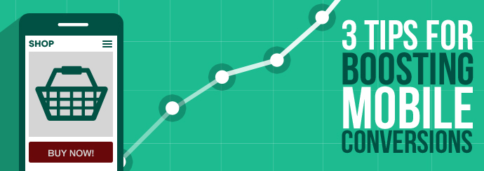
If you want to turn your mobile visitors into mobile customers, here are three tips for giving them a better experience and boosting your mobile conversions:
It's a small screen - don't clutter it up!
The most obvious difference between mobile phones and desktop PCs is the screen size. When you're thinking about how your website should look on a mobile phone, be sure to make the most important elements instantly and clearly visible - this may mean stripping back the less essential parts of each page (such as promotional banners and unnecessary text) so as to fit everything in without making it hard to read. If users are having to scroll back and forth and squint at their screens just to find what they're looking for, there's a pretty strong chance that they'll give up before they reach the checkout.
Speed is everything!
This mantra doesn't just apply to loading times (although these are obviously critical on any device); it also applies to the user's journey through your site. Bear in mind that mobile users often have limited time to spend on your site, particularly if they're on a train or in the loo (you may laugh - 75% of people admit to doing it!)
If you want users to be able to fit a transaction into this short window of time, you need to make the whole process as quick as possible. If your site doesn't already use PayPal, consider adding it, as this will save a lot of users from having to painstakingly enter their payment details. An 'express checkout' option can also help - is it really worth forcing new users to register for an account before purchasing? Some will do it, but many will simply go elsewhere.
More generally, it's a good idea to go through each step of your site's buying journey and note down any steps that could be streamlined or removed - remember, each step is another opportunity for your customer to change their mind and leave the site!
Keep payment simple
We've already mentioned PayPal, but that's not the only way to make payment that little bit less painful for your customers. Another important difference between smartphones and PCs is the lack of a mouse or keyboard, and this can make entering one's details on a mobile extremely fiddly. Make sure that the data entry boxes (card number, customer name, etc.) are of an easily-clickable size, and try not to include too many of them (do you really need their address, their telephone number AND their email address?)
Some more quick tips for the checkout page:
- Instead of forcing everyone to enter their addresses manually, use an address lookup system that allows users to enter a postcode and select the correct address from a drop-down list. This cuts down on the amount of typing required to complete a purchase.
- Make your delivery options as clear as possible. If, at a glance, people don't know a) how soon their items will arrive and b) how much it will cost, they'll be reluctant to go through with the purchase.
- Are there boxes to tick? If users have to tick a 'Terms and Conditions' box at the checkout, make sure it's nice and big - that way, they won't miss it, and it'll be easy to click on!
Want to make your site more mobile-friendly? Why not consider upgrading to a responsive design?