Clear Choice Stairlifts is a new and exciting brand that emerged onto the mobility equipment market back in 2018. The company began its life as a stairlift installation company working on a contractual basis, but since then have gone on to become an independent brand of their own.

They offer a range of professional stairlifts as well as comprehensive installation and maintenance services - the whole package for people who need a bit of extra help moving around their homes and gardens freely.

Working solely with market-leading stairlift providers Handicare, the Clear Choice team wanted a website that would showcase their mobility products and services in a professional manner. The site needed to reflect the tone of the Handicare brand, echo their outstanding reputation, but also represent Clear Choice as a brand in their own right.

It was noted that many of their potential clients are likely to be elderly and may struggle to use a site that was unnecessarily complicated. Therefore, it was important that we created a website that was simple and user-friendly while still delivering all of the necessary information.

What did we do?

When Clear Choice approached us, they didn’t have an existing website or online presence so we really had a blank canvas to work with! We spoke extensively with the client to make sure we had a good understanding of their business and the products they offer. Then we got to work…

To get things moving, our copywriters wrote fully optimised website copy to capture traffic for brand and industry-specific terms and phrases. This would ensure that anyone wanting to add a Handicare stairlift to their home was highly likely to come across Clear Choice Stairlifts in the Google search results.

The new website is fully responsive which means clients can browse Clear Choice on any device, so whether they use a mobile phone, tablet, laptop or desktop, the Clear Choice website will provide an impeccable user experience.

We also set up a YouTube channel and published a range of videos showcasing their products and services, which are also embedded throughout the new website. We knew videos would be especially beneficial to their clientele because they provide a quick, simple and visual way for users to digest information. Customers can also see each of the Handicare stairlifts in action before making a purchase.

When customers are ready to discuss their options, they can simply complete the enquiry form on the website, and then it’s over to the Clear Choice team to work their magic to help the client move freely around their home again. We’re confident that this new website will help Clear Choice Stairlifts build a happy and highly-relevant customer base in no time at all!

Check out the new Clear Choice Stairlifts website here.

If you think that your business would benefit from a bespoke website, don’t hesitate to get in touch with us. We’ll provide you with a free, no-obligation web design quote.

Get a Quote >

Creating a website that accurately reflects a company message, mood or image can be profoundly important when it comes to public perception of a brand.

That much is fairly obvious and it doesn’t take a genius the level of Leonardo Einstein to tell you that.

However, did you know that the very colours you use on said website can have a profound impact as well? It’s true – just ask Albert Da Vinci!

Don’t be left red-faced with an off-colour website. Leave the competition green with envy and get it right as we serve up these colourful tips on a silver platter.


colour and web design


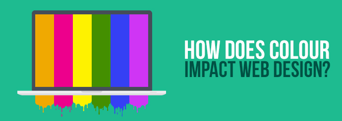
Importance of Colour in Web Design

A tonal misfire can be an instant turn-off for users and it’s no exaggeration to say that poor colouration can effectively deter custom and hinder business as a result.

For example, basic design knowledge will tell you that solid black text on a navy background will ultimately make the copy virtually unreadable – a digital sin if there ever was. Shame! Shame!

Similarly, placing white text on a bright yellow background is enough to sear corneas to the point of snowblindness, which I think we can all agree is not good for user experience.

Worse still, basic mistakes like this make a site immediately appear amateur which, in turn, makes your business seem second-rate as a result, ultimately impacting conversions.

If the web content itself is the leading man, the colour scheme deserves an Oscar for “Best Supporting Actor”. As such, getting it right is paramount.


Colour and Brand Association

Colour and branding go hand-in-hand like beer and pizza (don’t judge) and effective use of a shade can make that colour instantly associated with a brand.

In fact, according to a study by the University of Loyola (sadly, that’s “Loyola” – not “Crayola”) found that colour can increase brand recognition by up to 80%.

When you think about it, it makes perfect sense too. Can you imagine the McDonald’s M in emerald green? Or picture the Coca-Cola logo emblazoned in purple and yellow?

A lot of time and effort goes into establishing brand colours and so too should the colours you use in your website design.

Unless you’re Mark Zuckerberg, who simply chose blue because he’s colourblind (#FactOfTheDay).


Colour and Web Design

Colours have long been associated with a wide range of moods, feelings and emotions; for example, purple is often used to represent prestige and sophistication, while yellow is typical for happiness and optimism.

The same applies to websites. For example, the combination of greens, blues and whites is typical for tech sites, while bright and vibrant, high contrasting colours are often used for professional websites.


Colours and Services

In fact, this trend is so common that consumers can often subconsciously determine the nature of a business by the colours alone. As such, sometimes the colours can virtually pick themselves.

We asked company design expert, Jenna Francis, who had these pearls of wisdom to add:

“At Designer Websites, we’ve created hundreds of sites for a wide range of clients and have seen first-hand that colour plays a huge role in reinforcing the products and services on offer.

For example, we work with a number of lawncare businesses whose sites naturally look great with earthy tones, like darker greens, light browns and soft greys – colours you associate with the garden.

Meanwhile, we created a site for a company that sells sunrooms and verandas. Their site is a combination of sunny colours – like bright oranges, sky blues and shadowy greys – to reinforce their summery products.”


For more web design tips or to enquire about the web design services available at Designer Websites, why not drop us a line today? Call now on 01446 339050 or get in touch online by clicking the button below.

Contact Us

Tech news roundup

How time flies! Another week has zipped by, and it's time once again for our Friday roundup of key tech stories from the past few days.

BERT helps Google to deliver more relevant search results

Google Search processes more than 5 billion searches per day, and a fair number of those (roughly 15% according to Google themselves) use queries that the search engine has never seen before. So how does The Big G deliver an accurate answer when it's completely unfamiliar with the question?

Well, we haven't yet reached the point where computers can understand word strings in the same way humans can, but Google announced this week that they'd taken a great big step towards that goal. BERT (Bidirectional Encoder Representations from Transformers) is a neural network-based technology that helps Google Search to "process words in relation to all the other words in a sentence, rather than one by one in order".

What this means is that, in theory, Google will no longer overlook the importance of a word like 'to' in the query '2019 brazil traveller to usa need a visa'. On its own, the word 'to' may seem unimportant, but it has a big impact on the meaning of that search term as a whole. This is one example of how BERT will help Google Search to deliver more relevant answers.

This change will supposedly impact the Google results shown for 1 in 10 English-language searches. Read Google's own blog post on BERT here.

Pixel 4 has arrived

In other Google-related news, the company's latest smartphone - Pixel 4 - is now available.

Pixel 4's key selling points include:

  • Google assistant
  • Motion sense
  • Improved camera

Not to mention the very colourful advert, which you can view on Twitter.

The news - brought to you by Facebook

Finally, some US users spotted a new feature in the Facebook app this week. Facebook News will feature content from publishers like BuzzFeed News and The Wall Street Journal, some - but not all - of whom will be paid for their participation.

The shiny new Facebook News tab will be curated by human editors, and users can personalise the tab to make sure they're only seeing stories that interest them. This feature hasn't rolled out in the UK yet - it's not even widespread in America at the moment - but we could be seeing it on our phones before long.

Follow @Designer_Webs on Twitter for more tech news and insight!

Follow @Designer_Webs   Get a Web Design Quote

Our working relationship with recruitment specialist Ricky Martin goes all the way back to 2012, when he became the eighth winner of BBC One's The Apprentice.

Since then, Ricky has continued to go from success to success - just last year, he became the first Apprentice winner to hit the £1 million profit milestone - and it's been great to share that journey with him.

Our latest collaboration with Ricky is recruiterricky.com, a brand new website that showcases his achievements and areas of expertise.

Ricky's social media feeds are a prominent feature of the new site's design, making it easy for users to see what the man himself has been saying on Twitter and other platforms.

There's also a video page that incorporates a number of clips from Ricky's YouTube channel. If you want to hear his advice on everything from perfecting your CV to staying calm in a job interview, visit recruiterricky.com/videos and get ready to learn!

Visit Ricky's New Website   Request a Web Design Quote

Tech news roundup

Another working week is almost over, but before we switch off our computers and crank up our Friday night playlist, there's just time for a quick roundup of some interesting tech / SEO stories from the past few days...

Google rolls out new 'Search by photos' feature

Eagle-eyed Google users spotted a new feature in the company's mobile search results this week. Certain local search terms - such as pizza in Cardiff - now deliver a 'Search by photos' section that looks like this:

This section doesn't appear to have any fixed position, and it only seems to show up for queries with clear local intent (e.g. 'Italian restaurants in Chester' or 'wedding dress shops near me'). Nevertheless, this new addition to the SERP could present a great opportunity for local businesses to flaunt their visual appeal and engage with potential customers nearby.

Pinterest releases slimmed-down mobile app

On Monday, Pinterest launched a 'Lite' version of their mobile application. Where the standard iOS Pinterest app takes up approximately 143 MB, Pinterest Lite weighs in at just 1.4 MB - that's less than 1% of the main app's size!

Pinterest Lite is now available to Android users in the following territories:

  • Argentina
  • Chile
  • Colombia
  • Mexico
  • Peru

The 'Lite' app's primary aim is to make Pinterest more accessible to users in these emerging markets.

Google Maps offers additional assistance for visually-impaired users

Google Maps can be very useful when you need directions, but the tool's usefulness is somewhat limited if you're unable to see the directions it provides.

However, that may not be the case for much longer. Visually-impaired Google Maps users in Japan and the USA can now access detailed voice guidance to help them reach their destination safely and efficiently.

Google have released this video showing the improved guidance in action:

Follow @Designer_Webs on Twitter for more tech news and insight!

Follow @Designer_Webs   Get a Web Design Quote