AMP Development
Over the last decade or so, Internet usage has gradually shifted away from desktop PCs and towards the likes of smartphones and tablets. Nowadays, the majority of online activity occurs on a mobile device, and if you want to succeed online, it’s important to have a website that caters to users on the go.
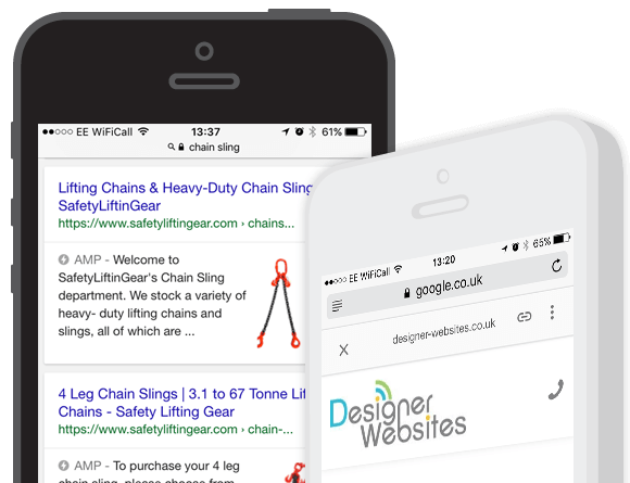
To that end, in 2016 Google launched the AMP Project, a new initiative with the goal of creating a smoother, speedier online experience for mobile users. Accelerated Mobile Pages are heavily cached, typically take less than a second to load, and use a fraction of the data required to load normal web pages.
Many website owners are now opting to add AMP to their sites in order to satisfy mobile users, who increasingly expect the pages they visit to load instantaneously. If you’d like to make use of Accelerated Mobile Pages on your website, then you’re in the right place, we have a team of AMP developers who utilise Google’s AMP technology to create stripped-down, fast-loading versions of your websites most popular pages. This has been shown to have a very positive impact on mobile user engagement and conversion rates.
Faster Loading Times
The longer your web pages take to load, the more you risk users clicking away and going to one of your competitors instead. Smartphone users tend to be especially fussy when it comes to loading speeds, so if you’re hoping to reach the many, many people who now use their mobiles to browse the Internet, it may be a good idea to incorporate AMP into your site to minimise load times.
Reduced Data Usage
Loading an Accelerated Mobile Page also uses up significantly less data than loading a regular web page, which is great news for mobile users who do not have an unlimited data plan. Using AMP within your website will put mobile users at ease and possibly even allow them to spend longer on your site, making them more likely to convert (e.g. make a purchase, send an enquiry, order a free sample of your product) before they click away.
Non-Mobile Users
AMP pages effectively exist in parallel to their non-AMP equivalents. When a user visits your page, they will automatically be sent to the AMP version if they are using a mobile device. If they’re not on a mobile device, they will see the normal version of that page as usual. This means that you can make your site better for mobile users without affecting desktop user experience.