With 85% of mobile search results now meeting Google's mobile-friendly criteria, the search giant has found a new battle to fight...
 
Intrusive Pop-Ups
 
Don't you hate it when you're reading an article on your smartphone and you're ambushed by an unexpected pop-up that takes up the entire screen? Well, it looks like the people at Google agree with you, because they've pledged to punish sites that use this technique by diminishing their mobile search rankings. This blog post (published last week on the Google Webmaster Central Blog) makes the following promise:
 
"To improve the mobile search experience, after January 10, 2017, pages where content is not easily accessible to a user on the transition from the mobile search results may not rank as highly."
 
The announcement feels like the start of a new chapter in Google's ongoing endeavour to give users the best possible online experience. You may remember 'Mobilegeddon', that day in April 2015 when Google changed its mobile search algorithm to favour pages with a mobile-friendly design; some time before that, in November 2014, they introduced the 'Mobile-friendly' label, which sat alongside mobile-friendly websites in the SERPs and helped users to identify at a glance which results would function well on their smartphones.
 
Interestingly, Google has now retired the 'Mobile-friendly' label, stating that "85% of all pages in the mobile search results now meet this criteria and show the mobile-friendly label". Since the majority of mobile results are now mobile-friendly (probably thanks in part to the 'Mobilegeddon' algorithm change), the 'Mobile-friendly' labels were starting to make things look cluttered, so Google has gotten rid of them. In doing so, the Big G has effectively declared this particular battle won: most of the pages listed in the search engine's mobile results are now mobile-friendly (i.e. you can read and use them on a smartphone without having to zoom in), so it's time to pack up and move on to the next fight.
 
And the next fight for Google is against pop-ups, or "intrusive interstitials" as the new blog post calls them. Pop-up windows tend to be pretty annoying no matter what device you're using, but they're particularly problematic for mobile users, especially when they fill the whole screen and effectively blockade the user from accessing the desired content. Even so, a lot of websites - including some of the largest, most well-respected media outlets around - use irritating interstitials for all kinds of different purposes, including:
  • Encouraging people to sign up to a mailing list
  • Telling users to install an app
  • Advertising
If your website uses pop-ups for any of these purposes, you may want to revise your strategy before the 10th of January, 2017. From that date onwards, Google will be penalising sites that use intrusive interstitials, meaning that your pages may stop showing in Google search results on mobile devices - and with mobile's share of total internet use increasing all the time, that's a loss that you probably don't want to suffer!

What kind of pop-ups will trigger a penalty?

Interstitials are used in many different ways throughout the Internet. Fortunately, Google has given us a pretty solid idea of which ones they're out to get and which ones will be allowed to slip through this new penalty's net. Here are a few examples...

Scenario #1: Sign Up Now!

Let's say you have a website featuring a variety of articles about all the latest movies and TV shows. When somebody reads one of your pieces, they can view everything above the fold without interruption, but as soon as they scroll down, surprise! A pop-up window appears containing a message like this:
 
SIGN UP NOW!
Join our mailing list and you'll never miss the latest news and insights from our team of talented writers.
 
Enter your email here...
 
Don't worry, we'll never send you any spam and you can unsubscribe at any time.
 
The frustrated user now has to tap on the little 'x' in the corner of your sign-up form in order to carry on reading. It's highly likely that sites using this sort of tactic will be penalised under Google's new rules, so if you're currently using pop-up forms like the example above, you should strongly consider changing tack before the 10th of January.
 
(To be honest, this isn't a great way to encourage people to join your mailing list anyway, as it disrupts their experience of your site and possibly sours them on your brand as a whole. You'll make your users happier - and probably get more sign-ups in the long run - if you take a different route, e.g. placing a call to action at the end of each article rather than covering up the article itself.)

Scenario #2: Try the App!

Let's now imagine that your film and TV website has a mobile app that makes it easier for smartphone users to navigate and consume your content. You know that your website, while mobile-friendly, isn't as good as your app when it comes to giving smartphone users a good online experience, and so whenever a mobile user arrives on your main site, you show them this pop-up:
 
BROWSING ON YOUR SMARTPHONE? RIGHT THIS WAY!
Our app makes it easy to keep up with everything we post.
 
Download from the App Store >
Download from Google Play >
 

You might think that you're doing your readers a favour here by directing them to a more user-friendly platform, but in reality, most people will just be annoyed that you've put a great big pop-up in the way of the article they wanted to read. Sites that do this probably will be penalised in Google's mobile rankings unless they cut it out by the 10th of January.

 
Bear in mind that Google's goal is to satisfy each query as quickly and as smoothly as possible. If they send someone to your website, it's because the algorithm thinks you have the information or the content that person wanted; if you put up barriers between the users and that content, there's a good chance that Google - eager to achieve total user satisfaction - will send people somewhere else instead.

Scenario #3: How Old Are You?

Finally, let's look at an example of an interstitial that most likely won't result in a penalty come January 2017.
 
Imagine you own an ecommerce website that sells wines and spirits online. Because alcoholic drinks are an age-restricted product, you are required by law to ask each user to verify their age before admitting them to your website's content. One easy way to do this? A non-dismissable pop-up that appears as soon as someone lands on your site for the first time and prompts them to enter their date of birth.
 
PLEASE ENTER YOUR DATE OF BIRTH
 
DD MM YYYY
Click to select country...
 
To view this website, you must be over the legal drinking age in the country where you live.
 
Since this interstitial is in place to fulfil a legal requirement, your website should be spared when Google cracks down on intrusive interstitials in January. Another example of a legally mandated pop-up would be a notice explaining that your website uses cookies.
 
Google are also saying that they'll let you off if your pop-ups "use a reasonable amount of screen space". This suggests that site owners will still be able to get away with using pop-up banners as long as they don't cover too much of the content being viewed. An example would be a small banner that appears at the top or bottom of the screen prompting users to click a link or download an app.
 
Download the Google app
In fact, Google use this approach themselves!
 
Worried that your rankings will be affected by the forthcoming Google penalty? Anxious to remove the pop-ups from your website before they cause any problems? Get in touch with Designer Websites today - call 01446 339050 or click here to request a quote for a new, Google-friendly website design.
JSM Responsive Website

JSM Models & Effects called up the Designer Websites office recently because they wanted to give their online presence an overhaul. JSM create all kinds of amazing models and visuals for projects large and small; however, their rather dated website wasn't really doing the company's work justice, and so they asked us to come up with an attractive, modern-looking design that would capture both the attention and the imagination of potential clients.

As ever, our web design experts were more than up to the task, and we believe we've succeeded in producing a website that's worthy of JSM's spectacular creations.

All images courtesy of JSM Model Makers

The new website has a responsive design, which means that it's easy to use and appealing to look at no matter what device you're using. The design automatically adapts to the screen on which it's viewed, resulting in a superb user experience for everyone.

It's always a joy to create a website like this one, because the visual elements (photos of JSM's models, in this case) do most of the talking. That being said, there are a lot of other things to take into account behind the scenes, and we all worked very hard to ensure that every element of the new JSM website was spot on. Our UI and dev teams concentrated on delivering a smooth, intuitive journey through the website, while our SEO specialists collaborated closely with the guys at JSM to make sure that the site copy was search engine-friendly while also appealing to the company's target audience.

All in all, this was a very enjoyable project to work on, and we hope that JSM are as happy with the finished website as we are. To see it for yourself, visit www.modelmakers.co.uk now.

Do you need a responsive website for your business? Whatever your industry, we'd be thrilled to hear from you - give us a call on 01446 339050 or click here to request a quotation.
M-Commerce Tips

You probably knew this already, but a lot of people use smartphones to browse the Internet nowadays. The total number of mobile web users is almost constantly increasing, and if you have a website, you may well have noticed that more and more of your traffic is coming from mobile devices.

We'll use ourselves as an example. In April 2012, less than 5% of Designer Websites' total site traffic came from mobile devices. By April 2015, that number was up to 12%. Our total site traffic for April of this year was 32% mobile, meaning that roughly 1 in 3 people who visited www.designer-websites.co.uk this April did so using a mobile device such as a smartphone.

Mobile Usage Graph

Bear in mind that our website is primarily targeted at business owners, most of whom are probably sitting at their desks when they discover us; the spike in mobile use becomes even more pronounced when you look at a more consumer-focused website. Here's what that graph looks like when we take the data from www.gadgetinspector.co.uk, an ecommerce (shopping) website that specialises in gadgets and gifts:

Gadget Inspector - Mobile Usage
Thanks to the Gadget Inspector team for giving us permission to share this data.

Make no bones about it: mobile users are a segment of the market that you can't afford to ignore, especially if you have an ecommerce website. According to pymnts.com, over 18 million consumers in the UK alone are estimated to shop using a mobile device on a regular basis (that's 6 times the entire population of Wales!) and this is an audience whose commerce you may be missing out on if your website isn't offering mobile users a good online experience.

So how can I capitalise on the mobile revolution?

If you're ready to enter the m-commerce market and meet the needs of those 18 million mobile shoppers, there are a few important things you'll want to focus on. Here are our recommendations for ecommerce site owners who want to encourage mobile users to buy from them:

Get a responsive website.

The first and most crucial consideration for any budding m-commerce giant is developing a website that looks good and functions well on mobile devices. There are several different ways to approach this challenge, but we recommend using responsive web design techniques to ensure that your site can adapt smoothly to any screen size. A well-made responsive website will deliver a superb user experience across all devices, from PCs and laptops to smartphones and tablets, and it will save you from having to redirect mobile users to a mobile version of your site (e.g. m.example.com) that's separate from - and potentially inconsistent with - the site you're showing desktop users.

Creating an app specifically for mobile users may be a viable alternative to creating a responsive website, but while many businesses choose to explore the app option, this tactic does come with a number of drawbacks. For one thing, forcing mobile users to download an app may put some of them off, as downloading an app (even if it's free of charge) constitutes an extra commitment to your business that many consumers may not be willing to make. It makes sense for an ecommerce Goliath like Amazon to offer an app, as they have many committed customers who will enjoy having that extra convenience, but if your primary goal here is to entice new customers to your business then you're better off letting them discover and access your services via their phones' web browsers instead.

It's also worth noting that, according to searchenginewatch.com, mobile users make more purchases via browsers than via apps anyway. For these and other reasons, we would always recommend creating a responsive website for your business instead of targeting mobile customers with an app, at least in the first instance. The time to start thinking about apps is when you've already got a large base of customers who use their phones to access your business - at that point, perhaps they'll be happy to make that extra commitment in exchange for the added ease of an app.

Keep loading times to a bare minimum.

Nobody likes waiting an eternity for a webpage to load, but long loading times are particularly toxic when your users are on the go. Smartphone users want their content right away, and if you take too long to deliver it, a sizeable chunk of your traffic will bounce back to the search results and end up on a competitor's website instead. This infographic from KISSmetrics contains lots of interesting stats about load times and how they affect user engagement, but perhaps the most compelling titbit is this one:

"A 1-second delay in page response can result in a 7% reduction in conversions. If your ecommerce site is making $100,000 per day, a 1 second page delay could potentially cost you $2.5 million in lost sales every year."

Every second counts in the world of m-commerce, so make use of tools like Google's PageSpeed Insights to ensure that nothing is slowing your website down.

Make the payment process as simple as possible.

Once the user has finished browsing your website and filling their basket with all of your amazing products, you need to make it as easy as possible for them to complete the checkout process and finalise their order. Remember, convenience is key in the mobile market, and just as people won't want to wait ages for your site to finish loading, they might not have the time or the patience to register for an account and fill out loads of little boxes in order to finalise what may have been a spur-of-the-moment purchase in the first place.

So how can you make the last part of the purchasing process quick and painless for your site's users? The key here is payment integration; for example, many people have PayPal accounts, so if you can offer PayPal as one of your payment options you'll potentially save a lot of customers a lot of hassle.

If you allow (or indeed force) users to create an account with your business when they place an order, you may want to review that system before you attempt to conquer the mobile market. The idea with this sort of thing is usually to make life easier for repeat customers; by creating an account, these people are saved from having to enter their payment and delivery details anew each time they buy from you. Registering for an account is inconvenient in the short term because you have to fill out even more boxes, but it's more convenient in the long term because it means that future orders can be completed by simply entering a set of login details.

But here's the thing: the majority of mobile users probably aren't interested in that long-term convenience. They're not planning ahead, thinking of the precious seconds they'll save later if they take the time to register now - they just want to finish what they're doing as quickly as possible and get back to scrolling through Twitter. With this in mind, you may decide that it's better to scrap the 'Create an Account' step altogether, or at least offer an 'Express Checkout' option for users who aren't interested in registering.

HenStuff Checkout Page

Here's an example from the checkout page of www.henstuff.co.uk, an ecommerce website specialising in hen night accessories and party supplies. Registered users simply enter their login details; new customers can either create a new account ('Register Now') or checkout without creating an account ('Express Checkout').

Review and improve!

Websites are often very different  when it comes to how users interact with them, and so it's unlikely that you'll nail the mobile shopping experience right away. That's OK, though - you just need to keep an eye on how people are interacting with your website and make ongoing improvements as necessary. Tools like Google Analytics are great for reviewing mobile use of your website and identifying areas that need work; for example, if a particular landing page has an abnormally high bounce rate on mobile devices specifically, you may want to reassess that page's design and alter it to ensure that your mobile users are getting the same great experience as your desktop visitors.

Need some help with your m-commerce efforts? The Designer Websites team are here to help! Here are some of the services we can provide:
Google Search Console

Google Search Console (formerly know as Google Webmaster Tools) is an indispensable tool for site owners who wish to maximise their organic Google traffic. Search Console effectively allows you to view your site through the eyes of the search engine, so you can see which pages Google has indexed, which pages it thinks could be improved, and which potentially problematic errors it has spotted.

There are roughly two dozen different sections within Search Console, some of which deal with fairly complex stuff. For this reason, Search Console can be a little overwhelming when you see it for the first time, particularly if you don't know what phrases like 'structured data' and 'robots.txt' mean.

It's a good idea to learn about each section and check them all on a regular basis. However, if you're just starting out with Search Console and you only want to see the most important pieces of information for now, here are 5 key areas that you should be keeping a close eye on - we recommend checking each of these at least once a week to ensure that your website remains in tip-top condition.
Messages

1. Messages

If you only ever look at one part of your Search Console account, make sure it's the Messages window. If anything serious happens in any of the other sections - for example, if there's a sudden influx of crawl errors, or if Google's crawlers are unable to access your site - you'll get a message to notify you about the problem, and this is where you'll find it.

HTML Improvements

2. HTML Improvements

This part of the Console is all about your website's title tags and meta descriptions. Google will put a note in this section if it spots any of the following issues on your site:
  • A page's title tag is too long or too short.
  • A page's meta description is too long or too short.
  • A page doesn't have a title tag.
  • Multiple pages have the same title tag and/or meta description (duplication).
  • A page has a title tag that Google considers 'non-informative'.
  • Google finds some content on your site that it cannot index.
It's a good idea to stay on top of these issues and fix them as soon as they arise (this is usually a question of simply rewriting the title tag or meta description in question). Good-quality title tags and meta descriptions will benefit you in two ways: firstly, they will encourage people to click on your site when it appears in Google's search results, and secondly, they will help Google itself to identify which term(s) it should list your site for.

Mobile Usability

3. Mobile Usability

More and more people are using mobile devices to browse the Internet these days, so it's important to make sure that your site is providing a good experience for mobile and tablet users as well as for PC owners. In the Mobile Usability section of your Search Console, Google will flag up any issues that might affect your site's performance on smaller screens (if you have a responsive website design, this section should be clear at all times).

Index Status

4. Index Status

How many of your website's pages does Google actually have indexed? To discover the answer to this question, simply head to the Index Status section of your Search Console. You'll be presented with a number (e.g. Total indexed: 100), along with a line graph showing how your site's index status has fluctuated over the past 12 months.

Index Status Graph

If this graph shows a sharp drop, you may need to do some further investigation to find out why. If you've recently removed a lot of pages from your site, then the drop may not be a problem - it could simply mean that Google is no longer indexing all those old URLs that no longer exist. Conversely, it may be that Google has de-indexed large swathes of your site because it decided that a lot of your pages were too similar to one another, in which case you'll need to do some work on your site copy in order to get everything indexed again!

Crawl Errors

5. Crawl Errors

When Googlebot attempts to crawl one of your pages and something goes wrong, this is where you'll be told about it. Search Console's Crawl Errors section lists:
  • 'Not found' URLs (i.e. URLs on your site that go to 404 error pages)
  • 'Server error' URLs (i.e. URLs on your site that trigger a server error)
  • Blocked URLs (i.e. URLs on your site that Googlebot is blocked from accessing)
  • 'Soft' 404 errors (i.e. URLs that don't exist, but don't return a 404 error for some reason)
When an old URL shows up in the Crawl Errors section, it often means that there's still a link to it somewhere, even though the page itself has been taken down. You may also see misspelled URLs here if somebody typed your page's URL wrong when they linked to you. This is another section that it's really important to check frequently, especially if you have a large ecommerce website with a large, ever-changing range of products on it - errors can pile up very quickly on sites like these, fast becoming totally unmanageable!

Sitemaps

6. Sitemaps

Once of the first things you should do upon logging into Search Console for the first time is head to the Sitemaps tab and submit the URL of your website's sitemap file (e.g. www.example.com/sitemap.xml) to Google. This will help the big G to index all of your pages a little faster. You should also update and resubmit your sitemap file every time you add or remove pages on your website - resubmitting in these cases is a good way of notifying Google that there's something new to see, or that some of the pages they've currently got indexed are no longer in use.

Google may occasionally spot an error in your sitemap file, and if this happens they will notify you in the Sitemaps section. Sitemap errors most commonly occur when you delete a page but forget to remove its URL from your sitemap file. Errors can usually be fixed by simply regenerating the sitemap file and resubmitting it in Search Console.

Need help looking after your website? Struggling to figure out why you're not showing up in Google results? Our search engine optimisation experts can help - get in touch today!
Does the Fold Still Matter?
 
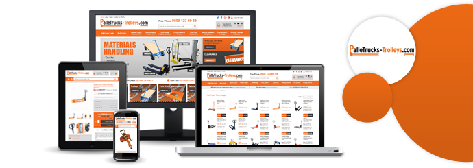
The last few years have seen some major changes in the way people consume information online. Most notably, mobile devices are now the most popular means of browsing the Internet, and that's a fact that web designers cannot afford to ignore: if your client's customers would rather shop on their smartphones than on desktop PCs, then you're making a huge mistake by designing primarily for full-size screens.
 
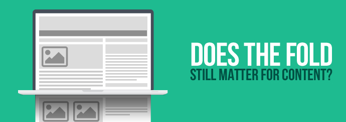
One big debate that's popped up as a result of the mobile revolution concerns the fold and whether it's still a useful concept for web designers to bear in mind. Today, we're going to take a closer look at this issue and find out if the fold still matters in a world where most people view the internet on mobile devices.

What is the fold?

When you first arrive on a webpage, the fold is the line that separates the stuff you see right away from the stuff you don't see until you scroll down. If content is 'above the fold', it's visible from the moment the page loads; content that's 'below the fold' is not visible until you scroll further down the page.

How do we know where the fold is?

Back when desktop PCs were the only option for people who wanted to surf the web, it was fairly easy to identify whether a given piece of content would be above or below the fold, because you could assume that your website would look more or less the same on every monitor. It's trickier nowadays because internet-capable devices come in all kinds of different shapes and sizes: content that's above the fold on a laptop may be way, way below the fold on a smartphone or tablet.
 
Unfortunately, it's not even as simple as a desktop/tablet/mobile trichotomy, because different phones and tablets often have vastly different screen sizes (for example, the fold is unlikely to be located in exactly the same place on both an iPhone and a Samsung Galaxy). Shrewd use of responsive web design techniques will ensure that your website looks good and functions well on every device, but this doesn't change the fact that parts of your homepage will be above the fold on some screens and below it on others.
 
But is this a problem? That's the question we're really here to answer today: should you be worried when a critical piece of content falls below the fold, or has the entire concept of the fold become outdated and irrelevant?

Here's why the fold isn't as important as it used to be

The argument against the fold having any bearing on modern web design hinges primarily on the idea that present-day web users are happy to scroll down in order to find what they're looking for. And when you think about this, it makes sense: smartphone screens are relatively small, and it's rare to see a webpage that fits the entirety of its content into that limited space. When you read a news article on your phone, for example, you often can't see anything beyond the headline until you scroll down a little.
 
As we mentioned earlier, the majority of Internet use now takes place on mobile devices, and as a result, there's really no reason to be afraid of forcing your users to scroll down any more. Unlike the PC owners of yore who didn't even have mouse wheels, mobile users generally don't mind scrolling to reach the meat of your webpage; in fact, their daily online experiences have arguably conditioned them to expect it. Whether you're scrolling through your Twitter feed, a Spotify playlist, or a list of products on an ecommerce website, it's plain to see that scrolling, not clicking, has become our primary method for interacting with the Internet. Heck, you've probably seen at least one website that consists of just one page and is navigated simply by scrolling through the entire thing.
 
(If you haven't come across a website like that before, www.tacklestore.net is a good example - note that clicking an option in the header menu simply causes your browser to auto-scroll straight down to the relevant portion of the page.)
 
So, given that your customers' thumbs will be poised to start scrolling as soon as your website loads, there's no need to worry about the fold at all, right? Even if your Enquire Now > button is buried all the way down at the very bottom of the page, all those hours spent flicking through Facebook posts have left people perfectly content to scroll more or less infinitely, yes?
 
Well...not necessarily.

Here's why 'above the fold' still matters

While the fold is no longer a Bermuda Triangle-esque vanishing point for user engagement, it's still important to think hard about what's at the very top of your webpage. It's true that most users in this day and age don't mind a spot of scrolling, but you have to give them a reason to scroll or they'll just go away and visit somebody else's site instead. And when Google spots that its users are consistently leaving your website almost as soon as they've arrived, your rankings will disappear faster than the last bacon-wrapped sausage on Christmas Day.
 
The key here is to think about your website from the perspective of a hypothetical user. Look at your page on a variety of different devices (desktop, mobile and tablet) and ask yourself these two questions:
  • Is this what the user will be expecting to see? If your website sells laptops, and you're primarily targeting people who want to buy laptops, then the topmost thing on your homepage should NOT be a blog post about how to use Google Docs. It may be a brilliant, insightful read, and it may even be of interest to some of your customers, but the main reason they're on your website is to shop for laptops. Your above-the-fold content should first and foremost aim to welcome users to the page and confirm that they're in the right place.

  • Are we giving the user a reason to take further action? Reassuring the user that, yes, your website is the one for them is half the battle. The next thing you have to do is encourage them to take action. That doesn't have to mean buying something or telephoning your sales team, at least not right away. But while it's no longer necessary to place your main call-to-action at the top of your page, you at least need to entice the user to go further with their investigation. The first thing users see on your site should be something that makes them want to read more, or click through to view some examples of your work, or follow you on Twitter because you're clearly the greatest wit of your generation. Be sure to bear this in mind when you're thinking about your above-the-fold content.

Examples

Here are a couple of websites that, in our opinion, have managed to get their above-the-fold content just right:
 
 
Access Training Academies
 
This company delivers accredited trade training courses across the UK.
  • Is this what the user will be expecting to see? Yes - the heading immediately confirms the company's name and gives a rough summary of what they do ("Electrician Courses, Plumbing Courses & More"). Whether the user was specifically looking for Access Training Academies or simply researching potential training providers, the above-the-fold content makes it clear from the off that this site has what they're after.

  • Does this give the user a reason to take further action? Again, yes - the 'Course Finder' tool makes it easy for budding tradespeople to find the area they're interested in and skip straight to the relevant course(s). The telephone icon that appears in the top-right corner of the page when it's viewed on a mobile device also makes it apparent that customers can contact the company directly if they require any assistance.
 
Floormaker.co.uk
 
This is an ecommerce website with a wide variety of flooring products on offer.
  • Is this what the user will be expecting to see? Almost certainly - there's confirmation that Floormaker is a "flooring supplier" directly under the company's logo, and references to the likes of laminate and solid wood flooring give customers further reassurance that this website is likely to feature the type of product they're after.

  • Does this give the user a reason to take further action? Yes. Visitors to the Floormaker website are presented with several options right off the bat: browse the laminate or solid wood ranges, use the search bar to find something specific, or use the live chat software to speak with someone who knows what they're talking about. Note also the icons underneath the search bar (free samples, free delivery, 5 star reviews, etc.), which offer the user some very good reasons to stick with Floormaker and investigate the company's website further.
If you'd like a business website that's designed by professionals with a firm grasp of all the latest web design techniques, please call Designer Websites on 01446 339050 or click here to request a quotation.