When it comes to commissioning a web design and development project, we understand that the process can sometimes be confusing for business owners, particularly those who are building their online presence from scratch. Perhaps the most confusing aspect of all, is the level of input required from the business owner, which can vary massively depending on each case. While some clients may have a very specific idea in mind that they are determined to stick to at all costs, others may want to hand over most of the work to the design team, as they feel that they lack the direction and knowledge required to make a truly informed decision.
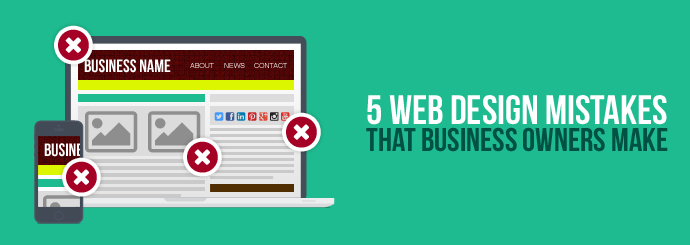
At Designer Websites, we’ve helped a variety of clients over the years, and feel it’s important to inform those who are looking to commission a website, about the steps they should be taking both before and during the process. Here a few common mistakes that can be made when planning a website, along with some advice about how and why to avoid them:
Mistake #1 - Setting your sights on a design that’s wrong for your business:
A common problem that may arise at the very beginning of the process, is a request for a design that is completely wrong for the business in question. While it can be useful to browse the internet for design ques, in order to get a better idea of which direction your headed in, insisting on emulating a design that has nothing to do with your business, can only end in disappointment. While it goes without saying that your design should be visually appealing, this also has to combine with functionality and business aims in order to create a truly successful website. There is little point in having a website with an ultra-sleek design that fails to sustain the interest of your customer, or present any of the required information to promote your brand and services. Having a clear idea of what you want can be a big help to your design team, but be prepared for these ideas to evolve according to the needs of your business, and the purpose of your site.
Mistake #2 – Assuming that the design doesn’t need to perform on mobile:
Despite the hundreds of articles that have circulated in recent years, which insist on the importance of having a mobile-friendly website, some businesses continue ignore this vital element of modern web design. Whether you think that your target demographic are likely to search predominantly on mobile devices or not, there’s simply no denying the fact that mobile search has overtaken desktop, which means that regardless of your audience, there will be many people who arrive on your site his way.
If you deal in ecommerce, then this should be something of a no-brainer for you, although a mobile-friendly design can also present a range of benefits to sites who are not looking to target direct sales. The main reason, which applies to any and all websites, is that Google have openly said that they favour mobile friendly websites, using it as a ranking signal to determine how your site shows up in search results.
Mistake #3 - Forgetting functionality:
Business owners can sometimes neglect the most important element of the entire project – the end user. If your design is based solely on what you think looks and sounds good, or you just take a ‘web design 101’ approach to the project, then you’re completely missing the point of a great web design. It’s absolutely vital that you think about how your website will engage existing customers, and also consider how to attract new followers to your brand. Your website has to be easy to use, and it also has to deliver what people are looking for when they discover your business. While there are best practices that apply to all web designs, you have to think beyond the basics if you want a website that both meets and responds to the needs of the intended user.
Mistake #4 – Coming to the table without aims, ideas and targets:
A flaw that can sometimes hinder the design process, is the fact that many business have realised that they need to appear online, but aren’t sure how to go about it. A website should not only compliment your business, but be an extension of it, allowing you to enhance existing services and attributes, while also generating new possibilities. Before you begin the design processes, it is important that you consider not only what you want the website to achieve, but also what is possible in the modern digital world. You also have to make sure that this aim is clear enough to be understood by the viewer, in conjunction with the last point about usability. Some points to consider include:
- If I want to influence sales through my website, what is the best way for me to do this?
- How do I want potential customer to contact me?
- Am I looking to provide an extension of my services to existing/typical users, or am I looking to appeal to a different audience?
- What messages are most important to by business? What’s the first thing I want people to see?
- What images do people in my industry respond to? Am I looking to correspond to certain expectations, or do I want to provide a new/unconventional experience?
- Will I need scope to add new content and additional features in the future? How could this website potentially expand my business?
Mistake #5 – Stuffing in social media for the sake of it:
Using social media for business has become almost as important as the website itself, and for many businesses this may even prove to be just as influential for driving business. The problem with using social media within, or in conjunction with, your business, is that there is no universal approach to success with it, and not every platform will provide a positive result for a business. Having said this, choosing the right social media platform, and including this in your website in the correct manner, can provide tremendous results for your business. After thinking about which accounts you should have in the first place, your second thought should concern how these will fit into your website. Social feeds and icons need to enhance your website, not hinder it, so be very cautious about adding these in without careful consideration. Here are some examples of questions you should ask yourself, before rushing into the set-up of your on-site social media:
- Which icons should appear? Do I need to provide every social media account, or just those which are most valuable to the business?
- How should these social icons appear? How can I make them prominent, without distracting from the more important features of the website?
- Is a feed right for my website, or will it just distract my users away from my site? Are my social accounts active enough to produce a feed which looks up-to-date and relevant?
If you’re have a web design project in mind, and are looking for the right knowledge and expertise to bring your vision to life, then get in touch with the team at Designer Websites! For more information, or to request a free, no-obligation quote, simply fill in our quick and easy contact form here.