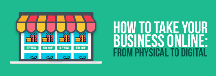
Website design psychology

Did you know that every detail on your website, from the colours to the typeface, has a psychological impact on your users? Website designers can influence the way someone feels when they visit your site by choosing design features that have a desirable psychological impact.

You're probably thinking: "Surely if my website looks nice, that should be enough?" Well, not necessarily. You can have a website that looks great, but if it doesn't appeal to the mindset of your target audience or reflect your brand positively, it probably won't convert as well as you'd hoped for.

Don't worry - you don't need a degree in psychology to understand the impact of different web design features. We've put together this helpful guide to introduce you to the psychology of web design. It's worth keeping these things in mind if you're thinking about a new website, but of course, our specialist website designers are always on hand to answer any questions you may have.

Structure and Layout

The structure of your website is fundamental to its success. Why? Because you want your users to find the things that they're looking for quickly, but you also need to add clean spaces for their minds to rest.

Websites that are over-cluttered and messy can be incredibly difficult to digest, so even if your page features all the photos, videos, and information that you deem necessary, you might be overloading users and driving them away.

We always recommend a website design that orders things in a logical way and features clean spaces between page elements and in margins. Keeping the features of the page relevant and concise will also help users to decide whether or not your website is a good fit for their query in a matter of seconds.

A clean, well-organised website is bound to make a good first impression and will psychologically reassure users that you aren't going to waste their time.

Colours

You've probably heard of the link between colour and emotion before, but in web design, this takes a more sophisticated form. Thinking beyond the typical 'red equals danger, blue equals sadness' conventions that we learn in school, colours can convey a lot of information about your business, so it's important to choose your colour palette carefully.

You've probably noticed that websites tend to have a neutral colour like white, grey, or mauve as the dominant colour throughout. This is because neutral shades are a great base for more interesting pops of colour, and they aren't too overwhelming for the user.

Different colours can be used to hint at the nature of your business. We tend to see cooler tones like blues and greens on more professional or 'serious' websites (our own site is just one example). Meanwhile, warmer tones like pink and orange might indicate a more creative or 'fun' business - take our clients Sweets in the City, for example. You can learn more about the relationship between colour and web design in our in-depth blog on this topic.

Typefaces

In the same way that the colours of your website can impact the way a user feels, so too can your chosen typeface. There are some typefaces that we subconsciously associate with traditional/professional businesses. These tend to fall under the category of serif fonts (fonts with feet). Some examples are Times New Roman, Georgia and Palatino.

In contrast, sans-serif fonts (without feet) have a more contemporary feel and are often used by tech companies to suggest modernity. Some examples of sans-serif typefaces include Helvetica, Arial, and Tahoma.

That being said, there are hundreds of different typefaces to choose from, so don't feel limited to the examples listed here. As a rule of thumb, choose a typeface that complements your brand while still being easy to read across all devices.

Price Order

We've already discussed why the visual layout of your site is important, but did you know the order in which you list your products and services has a profound psychological effect too?

One psychological phenomenon that online shoppers are subject to is anchoring bias. This meant that the user's perception of your products rests on the very first products they see (and become anchored to).

For example, if you list your most expensive products first, everything that the user sees afterwards will appear cheaper. Conversely, if you put your budget items first, you risk making your main line of products look overpriced.

Psychological studies have shown that anchoring bias is almost impossible to avoid; however, people who are more familiar with your products and pricing are less susceptible to it. With that in mind, it's important that you anchor products to the top of the page that are reasonably priced and a good reflection of your product portfolio.

When users land on your category page, you want them to see products that are cheap enough to be a good deal, but not so cheap that they're compromising on quality. Here are some more tips to help you make your category pages convert.

Trust and Confidence

The final thing to consider is whether or not your website design establishes trust and confidence. Whether you're providing legal advice or selling clothes, you need your users to trust you if you want them to convert.

We live in an age where digital scams and computer viruses are an everyday threat. At a brick-and-mortar store, customers can see the people behind the brand, ask questions, and even base their buying decisions on how friendly/helpful the staff are.

Online, you rely entirely on your website to provide the same great experience and make customers feel secure enough to part with their cash. There are a number of web design techniques you can utilise to help with this.

For example, you should refrain from asking for personal details like email addresses right off the bat. An immediate invasion of privacy before someone has had time to become familiar with your brand might be enough to send them elsewhere. Similarly, avoid adding multiple pop-ups and overlays, as these can appear spammy and make it difficult to browse the site smoothly.

Make a good first impression with a clean and logical structure, make it clear what you expect from your users at an appropriate time, and put security measures in place to put users at ease. Use a secure, well-recognised payment system like Sage Pay or PayPal, let users create password-protected customer accounts to store their personal details, and make sure your website is protected with an SSL.

Get all of these web design features right and you can create a website that's psychologically pleasing to your customers. If you're looking for web designers who can help create the best possible website for your business, get in touch with Designer Websites today!

Request a Free Website Design Quote

Improve your category pages

When you're trying to design a category page that will help drive sales, it's crucial to keep the customer's experience at the forefront of your mind. By navigating through your category pages, users should be able to easily find the products they're looking for and place their order.

At Designer Websites, we've been designing category pages for years, so we have a great understanding of what really works for our clients. We spoke to our lead designer, Jenna, and asked her what makes the perfect category page:

"We would always recommend that you use good images that are relevant and high quality, an interesting H1 heading that includes your page's keywords, and text that's short and relevant. Try to put your best-selling / most popular products towards the top of the page, and change them frequently so the pages look slightly different for returning customers."

Let's look at some of these different elements in more detail. You might find that some of these features are missing from your category pages, in which case, this might be a great opportunity to make some improvements.

1. Optimising Your Text

You want the text on your category pages to be concise, relevant and properly optimised for search engines. To achieve this, you should make sure that your category pages include a keyword-rich H1 heading and relevant information about your products.

Think of your category pages as a means for customers to get an overview of your products before making a purchase. You should try to describe the products or services on a category page using a few concise, easy-to-digest sentences, so users can quickly determine if they've chosen the right category.

In terms of SEO, you should try to include a range of keywords that are relevant to your category to increase the likelihood of your page ranking highly in the search results.

For example, if you own a cake business and you want to optimise the text on the category page for 'chocolate cakes' you might target keywords like, 'best chocolate cakes', 'chocolate sponge cakes' and 'chocolate birthday cakes'. You might find it beneficial to keep the text under the H1 (that users will see first) short but include more keyword-rich text towards the bottom of the page to improve your chance of ranking.

If your site is optimised effectively, someone searching for a 'chocolate birthday cake' should be taken to your category page where they can view all the chocolate cakes you offer. Someone searching more specifically for a 'vegan chocolate cake' might be taken straight to a product page instead, where they can read a detailed description of the vegan chocolate cake you supply and place their order.

2. High-Quality Images

When your business operates through an ecommerce website, customers are deprived of that real-life touch, feel and browse experience. It's important to use relevant, high-quality images on your category and product pages to really bring your products to life!

One thing that online shopping allows for is a comparison between brands. Your customers might be considering products from several different competitor sites as well as yours, so you want to provide the best possible experience you can and secure the sale.

Going back to our cake business example, imagine a scenario where a customer is looking for a great chocolate birthday cake. They're considering three or four local cake suppliers, including you. If your chocolate cake category page is filled with high-quality photos of truly tempting chocolate cakes, and your competitors have a few low-resolution images to compare to, you'll (probably) win the sale every time!

3. Featured Products

Highlighting products on your category page is a great way to boost sales. Moving products towards the top of the category page and adding a bold border or an eye-catching sticker is a great way to draw the user's attention towards the products you want them to buy. It also provides users with a sense that they are getting the best option or deal available.

Even if users only spend a few minutes on your category page before moving elsewhere on your site, the emboldened products are likely to stick in their minds. They might even decide to come back for a second look if they feel they've missed out on a good deal.

With that in mind, you should use the featured products section of your category page to focus on best-selling products, products included in special offers, and products that you want to shift quickly.

Keep your category pages fresh and engaging by rotating your featured products regularly. That way, returning visitors won't be greeted with the same products over and over again.

4. Filters

If your business boasts an extensive portfolio of products, you might want to consider adding filters to your category page so users can quickly find the items they need. Filters are a popular feature of most ecommerce websites because they break down categories into smaller, niche groups of products that more relevant to the user.

Let's say you own a shoe store and a customer visits your site hoping to buy a new pair of black high heels in a size six. They're going to a party at the weekend and (as usual) they've left it until the last minute to organise their outfit. When they land on your site, they see hundreds of different types of shoes organised into categories by style.

Luckily, your 'high heels' category page allows them to filter the shoes by size and colour. This instantly refines their search so they can browse all the pairs of shoes that fit their criteria. They spot a fabulous pair and place their order - success! That's one more happy customer who might recommend your shoe store to a friend or leave a positive review.

5. Search Box

No matter how well structured your site navigation is, there will always be some users who prefer to head directly to specific products. That's where the search box comes in handy.

It's important that your database is organised so that the right products show up for the right queries - you wouldn't want a user searching for 'black heels in size six' to be faced with an array of blue trainers, would you?

Data from the search box can also provide you with insights into the products that are most frequently searched for by your customers. Perhaps they're struggling to find the products they're looking for; in which case you could tweak your site navigation so frequently-searched products are easier to find.

Alternatively, frequent searches could indicate that a certain product is very popular with your customers. In this case, you might decide to run a special offer or add it to your 'featured products' section to boost sales. Either way, having a search box on your category page will benefit you and your customers.

If your ecommerce website needs an overhaul, Designer Websites can help. Our experienced team of designers, developers and SEO specialists understand what websites need to succeed - contact us now to discuss your requirements!

Get a Free Ecommerce Website Quote >>

Clear Choice Stairlifts is a new and exciting brand that emerged onto the mobility equipment market back in 2018. The company began its life as a stairlift installation company working on a contractual basis, but since then have gone on to become an independent brand of their own.

They offer a range of professional stairlifts as well as comprehensive installation and maintenance services - the whole package for people who need a bit of extra help moving around their homes and gardens freely.

Working solely with market-leading stairlift providers Handicare, the Clear Choice team wanted a website that would showcase their mobility products and services in a professional manner. The site needed to reflect the tone of the Handicare brand, echo their outstanding reputation, but also represent Clear Choice as a brand in their own right.

It was noted that many of their potential clients are likely to be elderly and may struggle to use a site that was unnecessarily complicated. Therefore, it was important that we created a website that was simple and user-friendly while still delivering all of the necessary information.

What did we do?

When Clear Choice approached us, they didn’t have an existing website or online presence so we really had a blank canvas to work with! We spoke extensively with the client to make sure we had a good understanding of their business and the products they offer. Then we got to work…

To get things moving, our copywriters wrote fully optimised website copy to capture traffic for brand and industry-specific terms and phrases. This would ensure that anyone wanting to add a Handicare stairlift to their home was highly likely to come across Clear Choice Stairlifts in the Google search results.

The new website is fully responsive which means clients can browse Clear Choice on any device, so whether they use a mobile phone, tablet, laptop or desktop, the Clear Choice website will provide an impeccable user experience.

We also set up a YouTube channel and published a range of videos showcasing their products and services, which are also embedded throughout the new website. We knew videos would be especially beneficial to their clientele because they provide a quick, simple and visual way for users to digest information. Customers can also see each of the Handicare stairlifts in action before making a purchase.

When customers are ready to discuss their options, they can simply complete the enquiry form on the website, and then it’s over to the Clear Choice team to work their magic to help the client move freely around their home again. We’re confident that this new website will help Clear Choice Stairlifts build a happy and highly-relevant customer base in no time at all!

Check out the new Clear Choice Stairlifts website here.

If you think that your business would benefit from a bespoke website, don’t hesitate to get in touch with us. We’ll provide you with a free, no-obligation web design quote.

Get a Quote >

Creating a website that accurately reflects a company message, mood or image can be profoundly important when it comes to public perception of a brand.

That much is fairly obvious and it doesn’t take a genius the level of Leonardo Einstein to tell you that.

However, did you know that the very colours you use on said website can have a profound impact as well? It’s true – just ask Albert Da Vinci!

Don’t be left red-faced with an off-colour website. Leave the competition green with envy and get it right as we serve up these colourful tips on a silver platter.


colour and web design


Importance of Colour in Web Design

A tonal misfire can be an instant turn-off for users and it’s no exaggeration to say that poor colouration can effectively deter custom and hinder business as a result.

For example, basic design knowledge will tell you that solid black text on a navy background will ultimately make the copy virtually unreadable – a digital sin if there ever was. Shame! Shame!

Similarly, placing white text on a bright yellow background is enough to sear corneas to the point of snowblindness, which I think we can all agree is not good for user experience.

Worse still, basic mistakes like this make a site immediately appear amateur which, in turn, makes your business seem second-rate as a result, ultimately impacting conversions.

If the web content itself is the leading man, the colour scheme deserves an Oscar for “Best Supporting Actor”. As such, getting it right is paramount.


Colour and Brand Association

Colour and branding go hand-in-hand like beer and pizza (don’t judge) and effective use of a shade can make that colour instantly associated with a brand.

In fact, according to a study by the University of Loyola (sadly, that’s “Loyola” – not “Crayola”) found that colour can increase brand recognition by up to 80%.

When you think about it, it makes perfect sense too. Can you imagine the McDonald’s M in emerald green? Or picture the Coca-Cola logo emblazoned in purple and yellow?

A lot of time and effort goes into establishing brand colours and so too should the colours you use in your website design.

Unless you’re Mark Zuckerberg, who simply chose blue because he’s colourblind (#FactOfTheDay).


Colour and Web Design

Colours have long been associated with a wide range of moods, feelings and emotions; for example, purple is often used to represent prestige and sophistication, while yellow is typical for happiness and optimism.

The same applies to websites. For example, the combination of greens, blues and whites is typical for tech sites, while bright and vibrant, high contrasting colours are often used for professional websites.


Colours and Services

In fact, this trend is so common that consumers can often subconsciously determine the nature of a business by the colours alone. As such, sometimes the colours can virtually pick themselves.

We asked company design expert, Jenna Francis, who had these pearls of wisdom to add:

“At Designer Websites, we’ve created hundreds of sites for a wide range of clients and have seen first-hand that colour plays a huge role in reinforcing the products and services on offer.

For example, we work with a number of lawncare businesses whose sites naturally look great with earthy tones, like darker greens, light browns and soft greys – colours you associate with the garden.

Meanwhile, we created a site for a company that sells sunrooms and verandas. Their site is a combination of sunny colours – like bright oranges, sky blues and shadowy greys – to reinforce their summery products.”


For more web design tips or to enquire about the web design services available at Designer Websites, why not drop us a line today? Call now on 01446 339050 or get in touch online by clicking the button below.

Contact Us

Part of the ever-expanding Greensquares family, DeckPlus is the newest brand to hit the UK composite decking market.

Offering a wide selection of decking products – ranging from premium, capped composite decking to affordable, eco-friendly hollow deck boards – the company were looking to create a fresh site that reflected this exciting new brand.

After laying down the gauntlet to our web designers, we quickly got to work creating a fresh, new site for his fresh, new brand.


web design, web designers, SEO experts


A One-Stop-Shop

Combining their existing TimberTech products with their all-new DeckPlus branded boards, the desired outcome of the project was conceptualised as an online amalgamation of decking solutions, providing the ultimate one-stop-shop for decking design.

The result was DeckPlus.co.uk – a true home for all things composite decking.

The DeckPlus website provides a welcome online home for the DeckPlus brand, while also acting as a worthy second-home for the company’s TimberTech range, in addition to the pre-existing TimberTech site.


A Modern Site for Modern Products

As part of the brief, we were asked to provide DeckPlus with a site that reflects their modern products.

Our team of expert designers were more than capable of living up to the challenge and were eager to create a site that accurately reflects the new brand’s contemporary flair, while also providing the necessary capabilities of an effective decking site.

Logically laid out in a prioritised order, each webpage is packed with all the user-friendly functionality you would expect from a professional site, blending helpful information with simple processes and easy navigation.

Topped off with a clean, crisp oceanic colour scheme, the aesthetic appearance of the site is modern yet inherently easy on the eye, with an occasional infusion of orange-brown as a tip of the cap to the company logo.


User-Friendly Functionality

From a functionality standpoint, we created an uncomplicated layout that provides seamless usability on all devices, working just as well on a mobile or tablet as it does on a laptop or desktop.

For further ease of use, the site is specifically designed to allow you to refine your decking search by a variety of chosen criteria: from colour and price to decking type and product range.

What’s more, the simple navigation bar positioned at the top of each page allows you to effortlessly transition from one page to the next, without the hassle or fuss of searching high and low for the relevant tab.

The site also features a company blog page to keep users up to date with all the latest goings-on in the company, as well as the wonderful world of outdoor decking.


Optimised Web Copy

DeckPlus offers a myriad of stunning designs and a variety of decking materials at a range of prices to suit all budgets. As a result, the site houses a vast online catalogue of these products and sub-categories, all requiring unique copy for each and every page.

This necessitated bespoke web copy for the entire site. Each page needed captivating copy that still included the all-important fundamentals: the essential top-line information, supplementing by the detailed nitty-gritty, before rounding off with the bottom line of price.

Meanwhile, each page was also painstakingly optimised by our SEO experts to give the site a running start when it was made live. This has helped to ensure the correct pages rank for the relevant industry terms and product descriptors in the search engine results, ultimately boosting the likelihood of conversions.


For more information on our web design and copywriting services, why not get in touch today? Call now on 01446 339050 or click the button below to get a quote online now.

Get a Quote