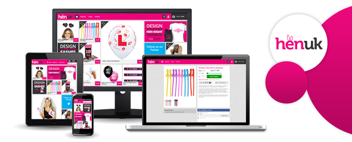
Hen UK are a new hen party company supplying hen accessories online to all of the UK. To stand out a saturated market, they wanted a snappy web design that looked sleek, user-friendly and was completely responsive across all mobile and tablet devices.
We are delighted to announce their website is now live, and we think it’s pretty snazzy indeed! We opted for minimal text because we wanted the design to do the talking. We filled the homepage with colourful images of some fun and cheeky hen night products for an overall aesthetically pleasing design.
The website is completely responsive, which means no matter how you choose to buy your hen products – via phone, tablet or PC, the customer experience will not be compromised, and Hen UK will look equally as snazzy on any device!
The result is a fun and flashy website which perfectly represents the band. Head on over to http://www.henuk.co.uk to check it out now.
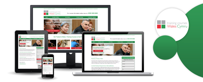
If you've ever felt like quitting your job and starting a completely new career, our latest project may well be of interest to you. We've been putting together a brochure website for Training Courses Wales, a company who specialise (as their name would suggest) in vocational training courses. The site went live yesterday, which means that budding plumbers, electricians, gas engineers and construction workers can now book onto relevant training courses right here in Wales.
The local factor is a big part of what Training Courses Wales are all about. They realised that many, many more people would be willing to train for a job in the trade industry if they didn't have to travel so far; catching trains, booking accommodation, and going days without seeing one's family are all big obstacles on the path to a new career. Would-be electricians in Swansea, for example, may previously have chosen not to undertake professional training because they couldn't make it to London or Manchester for a good quality course.
That's where this new website comes in. Training Courses Wales provide vocational training courses throughout South Wales, allowing a lot of people to start the career that they always wanted to have. The TCW site contains details on all of the different qualifications that you can gain from their courses, along with a slick enquiry form that interested parties can use to get in touch. If you want to see what exciting new occupations are at your feet, or if you just want to see an example of our handiwork, pop over to www.trainingcourseswales.co.uk now.
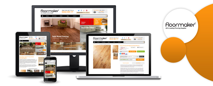
We've been looking after Floormaker's site for several years now, and our latest project for these well-established flooring suppliers was a new, responsive website design. A little while ago, the Floormaker team noticed that a growing portion of their site traffic was coming from smartphones and tablets, and since they wanted to give these mobile users the best possible experience, they picked up the phone and asked us to redesign their site.
The main result of our hard work is that the Floormaker site now responds to the device on which you view it. For instance, people who buy their floor using an iPhone will see a slightly different layout to Floormaker's PC-using customers.
Having said that, we made plenty of other changes while we were redesigning the site. Social media feeds are now prominently displayed on the homepage, making it easier for visitors to see what the brand is up to on Twitter and Pinterest. We also created a 'DIY SOS' blog, which the company can now use to answer any flooring questions their customers might have.
New features aside, the whole site generally looks a little sharper and more modern. Pop over to www.floormaker.co.uk now and see what you think of our handiwork!
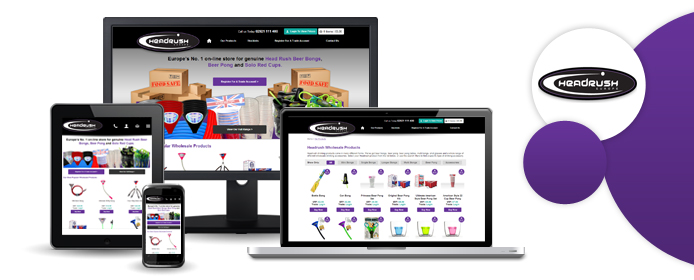
Headrush Europe is a wholesale supplier of beer bongs, beer pong tables, and all kinds of other drinking accessories. They supply these items to loads of big-name retailers; you've probably heard of Hawkin's Bazaar, MenKind, and Gadget Inspector, and these are just some of the companies that stock Headrush products.
Why are we telling you this? Because Headrush Europe's new website has just gone live, and we're the people who created it! Since Headrush are wholesalers, not retailers, this site is somewhat different to our other ecommerce projects. In addition to the usual shopping basket/checkout functionality, we put together a nifty application form through which customers can register for a trade account. The trade account allows stockists to keep track of their purchase history and make regular bulk orders from Headrush without any faffing about.
We're pretty pleased with the new Headrush website; if you're interested to browse for yourself, head over to www.headrusheurope.com and check it out.
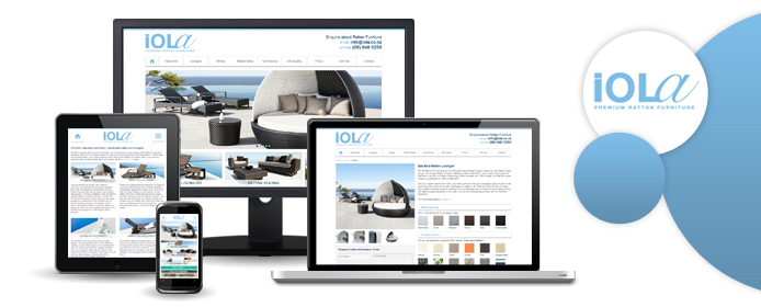
With responsive web design becoming more and more ubiquitous, you may have noticed that a lot of our client websites have been receiving the responsive makeover recently. We've already told you about Howells and TimberTech, and the design work that we did for both of those sites - well, Iola NZ is the latest website that we've made responsive.
Iola is a New Zealand-based outdoor furniture company. All of their products - chairs, tables, sun loungers, the lot - are hand-crafted by master weavers, and the furniture that they create is ideal for a cool, contemporary outdoor living space.
With this in mind, it was important to the people behind Iola NZ that their website should be as attractive and as modern-looking as possible. Hence the new responsive design; the revamped Iola website looks just as good and functions just as smoothly on phones and other mobile devices as it does on our desktop PCs.
Whether you view it on your laptop, your iPad, or your smartphone, we think you're going to love what we've done with the Iola NZ site. Check it out at www.iola.co.nz.