benefits-of-blogging-for-seo

When you blog for SEO, your main aim should be to create and update a blog that improves your search engine rankings for certain keywords. To do this, you will have to conduct keyword research, build links, optimise images, and write compelling and engaging content. 

All of this sounds like a lot of work, so what are the benefits of blogging for SEO?

More...

New SunSpaces Website Design

SunSpaces is part of Greensquares, a family of businesses specialising in high-quality, low-maintenance outdoor products. We've already revitalised Greensquares' porcelain tile and composite decking websites this year, and we can now add SunSpaces - the company's contemporary garden room brand - to that list.

Last week saw the relaunch of www.sunspaces.co.uk with a brand new design that we think will help the SunSpaces brand to really make an impact on the increasingly popular garden building market. Large, attractive photographs now dominate each page, and the improved user interface makes it far easier for visitors to browse and compare the various garden rooms, verandas and glass extensions available from the SunSpaces team.

As with PrimaPorcelain and TimberTech (the other Greensquares websites that we have recently redesigned), SunSpaces has also been switched from HTTP to HTTPS - click here to find out more about why we're recommending this to our clients right now.

Need a new look for your company website? Request a FREE web design quote here.

Online Booking Systems

Here at Designer Websites, we've created online booking systems for a wide variety of clients. Examples of the solutions we've developed include:

💊 Appointment booking systems for health clinics 
🔧 Boiler installation booking systems for plumbers / heating engineers 
😊 Visitor booking systems for leisure centres
⛷️ Equipment booking systems for ski holiday providers
⚖️ Consultation booking systems for legal practitioners

With all of these projects and more under our belt, we have a very strong understanding of what makes a good online booking system. Here are the five things that we consider to be most important:

A smooth, speedy user interface

Like any online application, an e-booking system should make the user's experience as pleasant and as painless as possible by loading quickly and functioning flawlessly. Your customers don't want to sit around twiddling their thumbs as they wait for a list of available timeslots to appear; nor will they enjoy trying to work out what to do next when your date selector doesn't load properly and the day they want to book isn't visible. Aim to get both your booking system and your website as a whole operating smoothly, with no glitches, no hiccups, and minimal load times.

A user-friendly date selection system

Make it as easy as possible for users to identify and select their preferred date and time. Many online booking systems utilise a month-by-month calendar layout, which is great because it's a format with which most people are familiar. However, whether you use the calendar style or not, you need to ensure that your customers can easily specify:
  • Their preferred date (or date range if, for instance, they're booking a holiday)

  • Their preferred time (if applicable)

  • The duration of their appointment

  • The type of appointment they're booking (if you offer a range of different services)
If users find it difficult to make these selections, they may well abandon your website and take their business elsewhere.

A clear breakdown of charges

Before asking for any payment details, you should provide each user with a cost summary that clarifies:
  • How much is owed
  • When this amount must be paid
In some cases, the full amount will need to be paid up front in order to confirm the booking; in other cases, the user may have to put down a deposit or booking fee to reserve their timeslot, with the remainder of the cost to be paid in person on the day of the appointment. Some hotels take credit card details upon reservation, but do not collect any money at all until check-in. However you have chosen to do it, it's important to make things crystal-clear to each customer before asking them to enter their payment information.

A simple and secure payment system

When your booking system includes an online payment step, the rules are just the same as on an ecommerce website: make the payment process as straightforward and as secure as possible. Consider using a popular online payment system like PayPal, as this will allow many of your customers to simply enter an email address and password instead of typing in their entire credit card number. Don't demand any personal information that you don't actually need - the longer the form, the more likely that a customer will give up before completing it. And, most importantly of all, make ABSOLUTELY sure that all payments are processed securely (under HTTPS rather than HTTP).

A detailed confirmation email

Once a customer has completed a booking on your website, you should immediately dispatch a confirmation email containing all the key details of their appointment (e.g. date, time, location, outstanding costs that you're expecting them to settle on the day). You should also endeavour to make it nice and easy to change appointment details in the event of an error; for example, if somebody requested a 2pm appointment when they actually wanted a 4pm appointment, you now need to give them an easy way of correcting their booking, whether by contacting a member of your team or by manually editing their appointment details online.

So, what makes a good online booking system? In short: clarity, simplicity, efficiency, and ease of use. If your business needs a new website with a fully-integrated online booking system, get in touch with Designer Websites now to request a quotation!

Mobile User Experience
 
Mobile user experience should be a core consideration for all web designers and online businesses. A huge portion of all online activity now takes place on a smartphone; Google have even created a completely separate index to make sure they're giving mobile searchers the best possible results. Even if your website works like a dream on larger screens, you'll lose a lot of potential customers if it's a nightmare for smartphone users.

So what can I do to make mobile users happy?

If you want to get a good return from your site's mobile visitors, you'll need to think about the user experience you're offering and how this translates to smaller screens. Mobile user experience quality depends on many different factors, but here are a few key areas to focus on:

Use a responsive design.

The first step towards total mobile-friendliness is upgrading to a responsive website design. Browsing a non-responsive website on a smartphone usually means 'pinching' to zoom in and get a proper look at the content; a well-designed responsive website will automatically adapt to fit the screen it's being viewed on, so no matter what device your customer is using, your content should display perfectly with no pinching required.

Don't bury important content.

One mistake that lots of people make these days is assuming that mobile users are happy to scroll indefinitely in order to reach the piece of content they need. It's true that scrolling is a more comfortable and fluid action than clicking/tapping, and because of this, it's safe to assume that most mobile users would rather scroll through a long page than click through several small pages (this is why people don't like those articles that display information in the form of a click-to-proceed slideshow). However, smartphone users don't have an infinite supply of patience, and you won't be doing anybody any favours by putting your important content at the bottom of the page, several screen-lengths down.
 
Wherever possible, the 'meat' of your page should sit above the fold (or, failing that, not too far below the fold). Make your important content - your call to action, your key info - immediately visible rather than assuming that people will be happy to scroll down to find it.

Be fast!

If there's one thing that everyone on the web (but especially the average mobile user) hates, it's a page that takes an eternity to load. Even if you don't care about ticking off smartphone owners, you should be striving to ensure that your website loads quickly for the benefit of your desktop visitors; if you are serious about maximising your mobile conversions, then site speed becomes even more important because lots of mobile users are browsing within a very limited time window. Perhaps they're killing time while they wait for the bus, or perhaps they're already on the bus and they've got one minute to peruse your website before their stop arrives - either way, time is of the essence and long loading times will cause frustration and quite possibly prompt people to try one of your competitors instead.
 
If you're not sure how to boost your website's loading speeds, try typing your URL into Google's PageSpeed Insights tool.

Space out your clickable elements.

Tapping a smartphone screen with your finger is a less refined, less accurate action than a mouse click, so if there's something on your website that you want lots of people to click on (e.g. a 'Contact Us' button, a hyperlink within a paragraph of text), you'd better make it easy for them. In order to meet the basic standard for mobile-friendliness, all clickable elements on your website should be:
  1. A good distance from all other clickable elements
  2. Big enough to tap with ease
Crowding a whole bunch of links into a small space increases the likelihood that users will click the wrong link by accident. Giving your clickable elements a tiny 'click zone' that requires hyper-accurate tapping increases the likelihood that users will need multiple attempts in order to land a successful click. Both of these outcomes are very frustrating for the user and will seriously damage their experience of your site, so make sure your clickable objects are large and reasonably far apart.

Make the user's journey short and simple.

Think of your website as a running track. The end user is a sprinter, and they cross the 'finish line' whenever they complete a conversion on your site ('a conversion' being the thing that you ultimately want users to do on your website - this could mean making a purchase, requesting a quote, subscribing to your newsletter, et cetera). Between the user and the finish line are a series of hurdles: actions that they must complete and hoops they will have to jump through in order to reach the conversion stage.
 
Your mission is to make those hurdles as few and as minuscule as possible. Make that running track as short and as unobstructed as you possibly can!
 
Here are a few example of 'hurdles' and how you can help your mobile users to overcome them with ease:
  • Finding the right page. The first 'hurdle' for most visitors to a website is working out where to find the thing they're looking for. You can minimise this hurdle with a clear site layout and intuitive navigation (i.e. not too many menu options, self-explanatory category names).

  • Entering payment details. This is a huge hurdle on some ecommerce websites - entering your credit card number and billing address and so forth is a tedious, time-consuming task, especially when you're using a touchscreen rather than a computer keyboard. Minimise this hurdle by using an online wallet service like PayPal or allowing users to create accounts and save their payment details for future purchases.

  • Entering contact details. Even if you're not selling anything through your website, the inevitable 'fill out this form' stage can still be a big hurdle for users en route to a conversion. Whether you're encouraging users to send a message, request a quote / call back / free sample, or sign up for something, they will always be forced to painstakingly tap in their details; however, you can minimise this hurdle by only asking for information that is crucially important. For example, why ask for someone's postcode, telephone number and date of birth if all you really need is a name and an email address?
If you need help optimising your website for mobile visitors, Designer Websites can help - get in touch now to request a quotation for your project.
Reduce High Bounce Rates

If you've ever logged into Google Analytics and seen a mountainous spike in your site traffic, you'll know how good it feels to get a nice influx of new users. Whether it's because a carefully-planned marketing campaign is paying off or because someone unexpectedly linked to your blog on r/TodayILearned, a healthy increase in sessions never fails to get those endorphins rushing.

But as pleased as you may be with that big traffic boost, it won't actually benefit your business much unless those visitors are sticking around long enough to make a purchase (or fill out a contact form, order a free sample, join your mailing list...you get the idea). All the web traffic in the world won't affect your company's bottom line if every user leaves your site within seconds of arriving.

If your website gets plenty of traffic but shows a very high bounce rate, be sure to keep reading - we've got some very straightforward tips that will help you to convert more of your visitors into customers. But first, let's just make sure we all understand one key piece of terminology...

What does 'bounce rate' mean?

Your website's bounce rate tells you how many people visit the site and then leave without any further interaction - in other words, how many people 'bounce off' after hitting your site. It is expressed as a percentage of the website's total traffic.

For example, if your website received 1,000 visits in November 2016 and Google Analytics is showing a bounce rate of 60% for that month, it basically means that 600 of your 1,000 visitors didn't get any further than the page they landed on to begin with.

Google Analytics shows a bounce rate for each individual page of a website as well as for the website as a whole. You'll usually want every landing page's bounce rate to be as close to 0% as possible, since a high bounce rate tends to indicate that users aren't getting what they want from your content. That being said, a bounce isn't always bad - for example, the following positive outcomes would still count as bounces:
  • A user arrives on your homepage, then calls you on the phone without navigating to any other pages.

  • A user arrives on a blog post, reads it from start to finish, then leaves your website to share the post on Twitter.

  • A user arrives on your 'Contact Us' page, makes a note of your email address, then closes the tab and sends you an email using their own email client (e.g. Microsoft Outlook).

  • A user arrives on a product page, makes a note of the price, then visits your bricks-and-mortar shop to purchase the item in person rather than ordering it online.
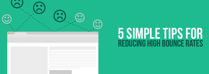
By and large, though, a high bounce rate is bad news for your business and a clear sign that you need to make some improvements to your website.

What improvements, you ask?

1. Focus on making a good first impression

It may be that people are leaving your website quickly because they're put off by the very first thing they see. Prominently displaying any of the following things on your homepage (or another key landing page) will almost certainly drive up your bounce rate:
  • Intrusive ads/popups (or 'interstitials', as Google calls them) that appear as soon as the page has loaded and get in the way of your actual content

  • Large swathes of text that the user will have to comb through in order to find the information they need

  • Dull and/or poor-quality images that fail to engage the user and risk making your brand look outdated, unprofessional, or unwelcoming

  • Potentially offensive, disturbing or triggering material that may shock, disgust or distress some people (it doesn't have to be a graphic depiction of violence or nudity - for instance, arachnophobes may click away immediately if you have a photo of a spider on your homepage)
Examine your landing pages carefully, or ask someone else to look at them with fresh eyes (they may notice issues that you've missed due to over-familiarity). Think about the first thing each site user sees: are you doing anything to irritate them, upset them, intimidate them, confuse them, or otherwise put them off?

2. Make it snappy!

While we're on the subject of first impressions, we really should mention site speed. Every day, countless website sessions are curtailed prematurely because the page simply didn't load quickly enough - you've probably given up on a fair few sites yourself after watching that loading icon spin for a little too long.

As a UX-conscious website owner, it is absolutely imperative that you minimise your site's loading times. Use Google's PageSpeed Insights tool to test your key landing pages, then follow the tool's recommendations as best you can (you may need to ask your web developer to make some changes for you).

3. Don't make promises your content can't keep

If your organic search traffic is showing an especially high bounce rate, it may be that Google or Bing is showing searchers a snippet that isn't particularly representative of your actual website. For example, imagine typing 'pizza near me' into Google and seeing this result:


'Great,' you think, 'just what I'm looking for.' But then you click onto Super Pizza's website and you quickly realise that it's not a pizzeria at all - it's a trendy digital marketing agency with a quirky name. Disappointed, you click your browser's 'back' button and return to the search results page to try a different website.

This is quite an outlandish example (though not necessarily that outlandish), but it illustrates the way in which misleading search results can lead to high bounce rates. Look at the words being used to advertise your website in the SERPs: does that little snippet of text promise something you're not delivering? Are you purporting to sell a product or provide a service that you no longer offer? Are you failing to clarify that you only serve customers in a specific part of the country? Are you roping people in with claims of low prices, then showing them a page full of products that are actually fairly expensive?

If so, you need to make a change. Ensure that each page's title tag and meta description give a fair, accurate, and up-to-date representation of what the user will find if they click through. And, if it's not already too late, you obviously ought to give your company a name that actually reflects the business you're in instead of trying to think of something...ugh...'random'.

N.B. If your bouncy traffic is coming from a source other than a search engine (e.g. social media posts, directory listings, banner ads on another website), this rule still applies. You should always do your best to ensure that people are getting exactly what they expect when they click a link to your site.

4. Keep your keywords on target

This one is a little trickier, because it's not always clear what people are Googling immediately before they land on your website. However, if you are getting a lot of high-bounce traffic from an organic search engine like Google or Bing, it may well be because your site is showing up for the wrong keywords.

Here's an example. Let's say you own a company that sells swimming pools and installs them in people's back gardens. Your website gets a lot of traffic, but the vast majority of visitors bounce because they were looking for a public swimming pool that they could visit with the family.

Now, you may well be able to fix this problem by doing as we recommended in point #3 and rewriting your title/description tags to more clearly indicate the exact nature of your business. But your site shouldn't be showing up for searches like 'swimming pools in nottingham' at all, and if it is, you may need to pick some different keywords and adjust your site copy accordingly. In this example, you ought to be targeting keywords that are specifically related to buying swimming pools, or to the swimming pool installation service that you provide.

And your keyword focus should be reflected in the copy you write - for example, this might be a sensible statement to include on your pool website's homepage:

Here at Petunia Pools, we sell a wide variety of home swimming pools to suit every budget. Furthermore, our pool installers have been in the business for thirty years, so they can be relied upon to get the job done quickly and professionally.

Whereas the following excerpt might well mislead the search engine bots and cause them to send the wrong sort of traffic to your website:

Looking for a swimming pool in Nottingham? We are Petunia Pools, the local business of choice for swimming pools in Nottinghamshire and the surrounding area. Get in touch today and get ready to go for a swim!

Recent developments in semantic search technology mean that Google et al are now far more adroit when it comes to recognising the meaning of a piece of writing in the same way a human would. However, that technology effectively relies on word association, so make sure you're sending out the right signals and using the right words in your website copy (e.g. 'buy', 'installation', 'home' instead of 'swim', 'Nottingham', 'local').

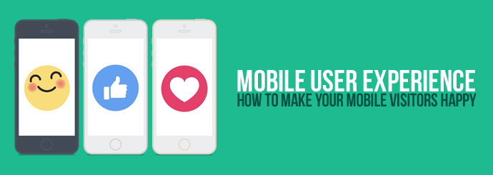
5. Don't forget the mobile mob

More and more people these days are yanking themselves away from their desktop computers and browsing the web on their smartphones instead. Log into your Google Analytics reports, go to Audience > Mobile > Overview, and take a look at what percentage of your site traffic currently comes from mobile devices. Given recent trends, we're guessing it'll be quite a high number; in fact, some of our clients are now getting around 80% of their traffic from smartphones.

With so much online interaction now taking place on a pocket-sized screen, your website's high bounce rate could well be a result of your failure to provide a good user experience on mobile devices. If that's the case...well, unfortunately, this one isn't such an easy fix. You ideally need a responsive website that functions equally smoothly across all devices - this should ensure that, no matter how big or small their screen is, each visitor finds it easy to navigate and interact with your site. Remember, the desktop PC is no longer the default platform for Internet use, and if you're serious about user satisfaction, you'll want to treat your mobile and tablet users just as well as you treat the people using a traditional mouse-and-keyboard setup.

If you need a new website design that will engage users and minimise bounces, Designer Websites can help. Get a quote for your project today.