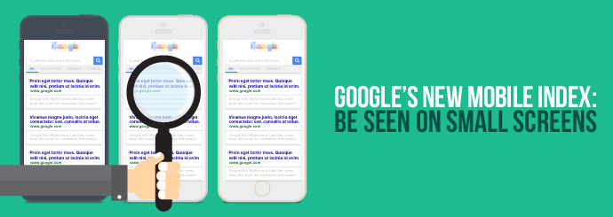
Google to Put Mobile Results First: Don't Get Left Behind!
This revelation isn't completely out of the blue, of course. Google's mobile and desktop results have been gradually looking less and less alike for quite some time now - in fact, we're already at the point where many websites rank highly for their keywords on desktop but not on mobile (or vice versa). However, all results are currently still pulled from the same Google index, and the forthcoming split could have a big impact on the SERPs when it happens.
And that's not all. Google's latest statement included the assertion that, to quote Search Engine Watch:
"This mobile index will become the primary Google index. The newly separated desktop index will not be kept as up-to-date as the mobile one."
In other words, the new mobile-specific index will take priority over the current index. This may seem surprising at first, but it actually makes perfect sense; more than half of all Google searches now come from mobile devices, so of course the company would want to ensure the quality of their mobile results above all else.
How can I rank highly in Google's mobile results when the new index arrives?
Some people will be reading this because they've already got high mobile rankings and they're anxious to keep them. Others may be here because they've never had much luck in Google's mobile SERPs, and they're wondering if this new index could be their big opportunity to change that.
Whichever boat you're in, here are a few tips for making sure you don't get left behind when Google's mobile-only index eventually comes into play:
1. Make sure your website is mobile-friendly.
This is a no-brainer, but since a lot of business websites still aren't optimised for mobile users, it's worth stating anyway. The best way to ensure that your website will work well on smartphones is to plump for a responsive design that automatically adapts to fit the screen it's viewed on - more on that subject here.
Some non-responsive websites have so far managed to slip through Google's net and rank reasonably well in mobile SERPs even though they're not mobile-friendly. However, the forthcoming mobile-specific index will almost certainly put paid to that, so it's a good idea to upgrade now and use Google's own mobile-friendliness testing tool to ensure that you're giving smartphone users the best possible experience.
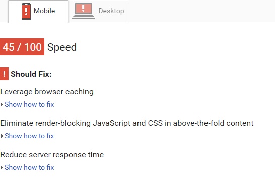
2. Minimise your page loading times.
If there's one thing that we all hate to see when browsing the Internet on a mobile device, it's a webpage that takes ages to load. Excessive load times discourage mobile users from interacting with your website, and if you don't speed things up, Google will quickly boot you out of their mobile rankings in favour of a site that doesn't force visitors to wait around.
In order to ensure that your website is loading as quickly as possible, test it using Google's PageSpeed Tools. This will inform you of any changes you can make to boost your site's load speed.
You may also wish to consider using AMPs (Accelerated Mobile Pages), a recent Google initiative that aims to make the web instantaneously accessible on mobile devices - learn more here.
3. Optimise for local searches.
If your mobile customers have their location services turned on, Google will serve them local results for certain queries. Here's what that looks like:
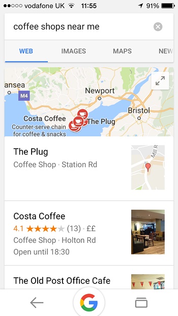
If this so-called 'local pack' shows up for your primary keywords, that's a good indicator that you need to be thinking about local SEO. You want your shop (or restaurant, office, clinic, etc.) to show up prominently in Google results when someone in the area searches for your service, and this can be achieved by:
- Add your business on Google My Business. Add your opening hours and a short written description of your organisation; you may also wish to embellish the listing with images.
- Ensure that your company name, address, and contact details are consistent throughout the Internet (i.e. on your website, your Google listing, your social media profiles, and any other listings you have online).
- Encourage people to review your business on Google, as well as on other well-known websites that publish reviews of local businesses (e.g. Yelp, TripAdvisor, Facebook).
- Ask other local businesses to link to your website (but only if they are reputable, their website is of a high quality, and the link is relevant to your business - e.g. if you own a hair salon, a link from a grocery store may not benefit you, but a link from a wedding dress shop might if they're encouraging people to visit your salon for a haircut before the big day).
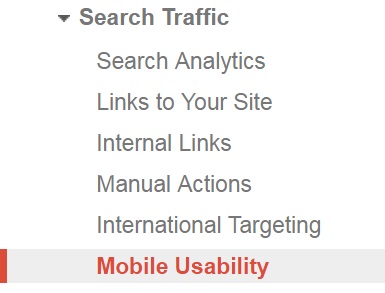
4. Use Google Search Console to stay on top of potential issues.
One final piece of advice (and this applies even if you're not interested in the mobile SERPs): add all versions of your website to Google Search Console and check the dashboard frequently to ensure that everything is as it should be and nothing is going wrong on your site. Of particularly relevance to today's topic is the Mobile Usability report, which can be found under Search Traffic on the left-hand side of the console.
This blog post highlights a few other reports that it's important to check regularly once you've added your site on Search Console.
* * *
If you want to ensure that your website is mobile-friendly and fully-optimised for this upcoming Google change, Designer Websites can help! Click here to request a quote, or select one of the following services to find out more about what we can do for you: