Frequently asked questions or FAQs are a staple feature of many websites, but did you know that they can be a valuable tool for boosting your site’s SEO (Search Engine Optimisation) and user experience? By featuring well-crafted and optimised FAQs on your website, you can help users find answers to their burning questions, improve your website’s ranking on search engine results pages and keep your users coming back for more!
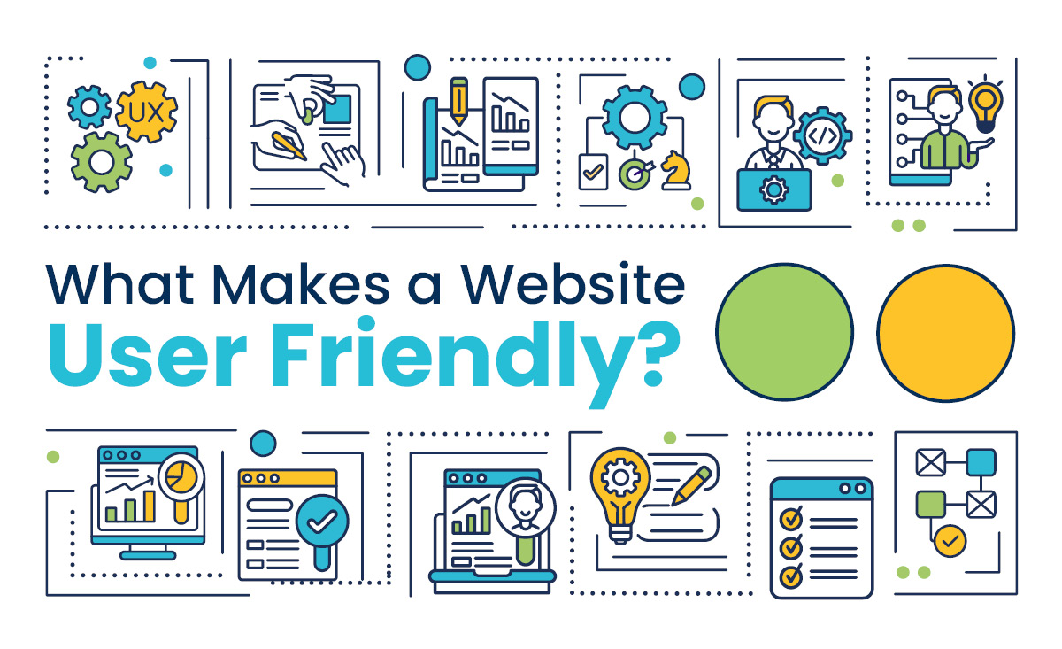
Before you start looking for ways to drive traffic to your website, you should first make sure that it's user friendly.
You may be wondering: what is a user-friendly website? A user-friendly website is one that users can access and navigate with ease, regardless of which web browser they're using and whether they're viewing the site on a PC or a mobile device.
Good usability makes users more likely to do what you want them to (e.g. place an order or join your mailing list). User-friendly sites also tend to rank higher on Google and other search engines.
So, what makes a user-friendly website? There are many different factors that help to make a website user friendly. Here are some of the most important parts of a user-friendly website:
- Responsive design
- Accessibility
- Loading times
- Mobile usability
Which is more important to a website's success: the actual content, or how it looks? Copy vs design is a topic that's sparked much debate among website designers, copywriters and digital marketing professionals.
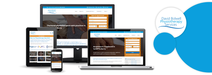
With clinics located in Barry, Canton and Whitchurch, and physiotherapists boasting BSc (Hons) degrees, postgraduate training and Chartered Society of Physiotherapists / Health Professional Council accreditation, David Bolwell Physiotherapy Services is one of the top physio clinics in South Wales. They possess extensive experience and provide treatments dealing with muscle, soft tissue and joint conditions, as well as post-surgery rehabilitation and sports injuries.
Here are some of the conditions that David Bolwell Physiotherapy Services treat:
- Neck & Back Pain
- Overuse Injuries
- Muscle & Ligament Injuries
- Osteoarthritis
These conditions are treated in various ways, including:
- Massage
- Acupuncture
- Acupressure
- Mobilisation & Manipulation
DB Physio Services asked us to give their old brochure website an enhanced look and feel, paying particular attention to the website’s usability on a number of devices and the ability to send enquiries with ease. We’re proud to announce that DB Physio’s new and updated website is now live – visit https://www.dbphysio.co.uk/ to see the new design.
What Have We Done?
In order to improve on the company’s existing site, we focused on a number of improvements:
- Responsive Design – A key aim of the new website was to allow users on varying devices with different screen sizes to experience the same great design. The new DB Physio website now possesses a fully responsive design that works well and looks great on any device.
- SEO – The need for high-quality content is imperative for any brochure website. We optimised each page of the new website and helped DB Physio to create information, high-quality content in order to rank highly on search engines like Google.
- Enhanced User Interface – The new DB Physio website allows the user to make a swift and detailed treatment enquiry. The updated enquiry form contains that ability to select the user’s preferred clinic and appointment date/time.
If you are in need of a professional-looking website for your business, please do not hesitate to get in touch with the team at Designer Websites. Request a FREE, no-obligation quote for your project here.
Mobile user experience should be a core consideration for all web designers and online businesses. A huge portion of all online activity now takes place on a smartphone; Google have even created a
completely separate index to make sure they're giving mobile searchers the best possible results. Even if your website works like a dream on larger screens, you'll lose a lot of potential customers if it's a nightmare for smartphone users.
So what can I do to make mobile users happy?
If you want to get a good return from your site's mobile visitors, you'll need to think about the user experience you're offering and how this translates to smaller screens. Mobile user experience quality depends on many different factors, but here are a few key areas to focus on:
Use a responsive design.
The first step towards total mobile-friendliness is upgrading to a
responsive website design. Browsing a non-responsive website on a smartphone usually means 'pinching' to zoom in and get a proper look at the content; a well-designed responsive website will automatically adapt to fit the screen it's being viewed on, so no matter what device your customer is using, your content should display perfectly with no pinching required.
Don't bury important content.
One mistake that lots of people make these days is assuming that mobile users are happy to scroll indefinitely in order to reach the piece of content they need. It's true that scrolling is a more comfortable and fluid action than clicking/tapping, and because of this, it's safe to assume that most mobile users would rather scroll through a long page than click through several small pages (this is why people don't like those articles that display information in the form of a click-to-proceed slideshow). However, smartphone users don't have an infinite supply of patience, and you won't be doing anybody any favours by putting your important content at the bottom of the page, several screen-lengths down.
Wherever possible, the 'meat' of your page should sit
above the fold (or, failing that, not too far below the fold). Make your important content - your call to action, your key info - immediately visible rather than assuming that people will be happy to scroll down to find it.
Be fast!
If there's one thing that everyone on the web (but especially the average mobile user) hates, it's a page that takes an eternity to load. Even if you don't care about ticking off smartphone owners, you should be striving to ensure that your website loads quickly for the benefit of your desktop visitors; if you are serious about maximising your mobile conversions, then site speed becomes even more important because lots of mobile users are browsing within a very limited time window. Perhaps they're killing time while they wait for the bus, or perhaps they're already on the bus and they've got one minute to peruse your website before their stop arrives - either way, time is of the essence and long loading times will cause frustration and quite possibly prompt people to try one of your competitors instead.
If you're not sure how to boost your website's loading speeds, try typing your URL into Google's
PageSpeed Insights tool.
Space out your clickable elements.
Tapping a smartphone screen with your finger is a less refined, less accurate action than a mouse click, so if there's something on your website that you want lots of people to click on (e.g. a 'Contact Us' button, a hyperlink within a paragraph of text), you'd better make it easy for them. In order to meet the basic standard for mobile-friendliness, all clickable elements on your website should be:
- A good distance from all other clickable elements
- Big enough to tap with ease
Crowding a whole bunch of links into a small space increases the likelihood that users will click the wrong link by accident. Giving your clickable elements a tiny 'click zone' that requires hyper-accurate tapping increases the likelihood that users will need multiple attempts in order to land a successful click. Both of these outcomes are very frustrating for the user and will seriously damage their experience of your site, so make sure your clickable objects are large and reasonably far apart.
Make the user's journey short and simple.
Think of your website as a running track. The end user is a sprinter, and they cross the 'finish line' whenever they complete a conversion on your site ('a conversion' being the thing that you ultimately want users to do on your website - this could mean making a purchase, requesting a quote, subscribing to your newsletter, et cetera). Between the user and the finish line are a series of hurdles: actions that they must complete and hoops they will have to jump through in order to reach the conversion stage.
Your mission is to make those hurdles as few and as minuscule as possible. Make that running track as short and as unobstructed as you possibly can!
Here are a few example of 'hurdles' and how you can help your mobile users to overcome them with ease:
- Finding the right page. The first 'hurdle' for most visitors to a website is working out where to find the thing they're looking for. You can minimise this hurdle with a clear site layout and intuitive navigation (i.e. not too many menu options, self-explanatory category names).
- Entering payment details. This is a huge hurdle on some ecommerce websites - entering your credit card number and billing address and so forth is a tedious, time-consuming task, especially when you're using a touchscreen rather than a computer keyboard. Minimise this hurdle by using an online wallet service like PayPal or allowing users to create accounts and save their payment details for future purchases.
- Entering contact details. Even if you're not selling anything through your website, the inevitable 'fill out this form' stage can still be a big hurdle for users en route to a conversion. Whether you're encouraging users to send a message, request a quote / call back / free sample, or sign up for something, they will always be forced to painstakingly tap in their details; however, you can minimise this hurdle by only asking for information that is crucially important. For example, why ask for someone's postcode, telephone number and date of birth if all you really need is a name and an email address?