Jobs in the IT sector have grown at almost twice the rate of jobs in other industries in the UK. Access Training Academies, a long-time client of ours, is passionate about helping people to retrain and pursue exciting new careers, and they recently asked us to create a website dedicated to promoting a new selection of IT training courses.

Access IT Careers aims to give each student a comprehensive introduction to their chosen profession and set them up for a long, successful career. They offer courses in the following disciplines:

  • Network Engineering
  • Cyber Security Engineering
  • Infrastructure Engineering

Why did Access Training Academies come to us?

We have worked with Access Training Academies before – their main website, which was also created by Designer Websites, offers training courses in trades such as plumbing and plastering. We were thrilled when they asked us to work with them again on their latest exciting venture.

We made Access Training Academies’ IT site mobile friendly so that users can check out these exciting IT courses with ease even when they’re on the go. In addition to the design and development of the site, we also optimised the website to rank well on search engines like Google and Bing.

If you need a professional website for your business, please get in touch with the Designer Websites Team. Request a free, no-obligation quote for your project here.

New Label Source Website

Label Source are a UK-based business who supply a comprehensive range of labels, tags and signs to customers all over the world. Their product range is too diverse to list in full right now, but here are just a few examples of what they offer:

  • Asset tags
  • Electrical warning labels
  • Workplace safety signs
  • Pipeline identification tape
  • Quality assurance labels
  • Warehouse markers
  • Shipping labels

Label Source recently asked us to give their old website a new, more modern-looking design; more specifically, they wanted to make it easier for smartphone and tablet users to view Label Source's products and make purchases online.

We're pleased to announce that Label Source's new and improved website is now live - visit www.labelsource.co.uk now to see how it looks.

What's new?

In addition to the clean, professional new look that we created for the Label Source website, we also made the following changes:

  • Responsive Design - As mentioned above, one of this project's key aims was to ensure a good user experience on smartphones and other mobile devices. The new Label Source site has a fully responsive design that looks great and is easy to navigate on screens of all sizes.

  • HTTPS Encryption - The entire Label Source website is now under HTTPS (as opposed to HTTP). This means that all information entered on the Label Source site is now sent securely, so the company's customers can place orders safe in the knowledge that their data is encrypted.

  • Improved Back End - We also updated the back end of the Label Source website to make it easier for the company to manage their product options and category pages.

Do you have an ecommerce website that's in need of a redesign? Contact Designer Websites for a quotation!

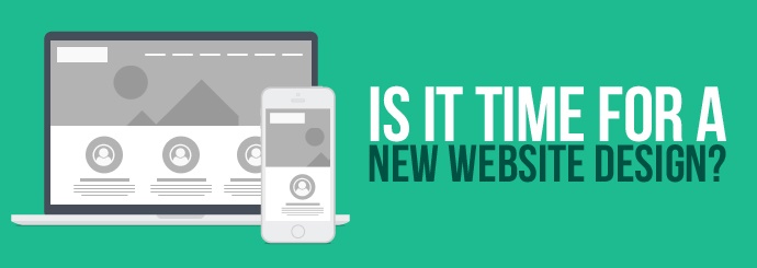
5 reasons to give your website an update (even if it's only a couple of years old!)

New Website Design

How old is your business's current website? One year old? Two? Three? Older?

You may feel like your website is as good as brand new, but things move quickly in the world of web design, and it's a good idea to rethink your site every couple of years. Why, you ask? Well, for a start, it's important to keep your website in line with all the latest guidelines and best practices from the likes of Google, but you also need to ensure that it's frequently reviewed from a usability perspective as well as from a performance perspective.

Over the past 12 months, there have been a huge number of changes to the way in which Google, Bing, and other search engines source and deliver their results. Additionally, voice and mobile usage are changing the way we browse and interact with the Internet in general - search engines have adapted accordingly, but has your own website kept up with new behaviours and technologies?

Today we'd like to highlight five relatively recent changes that, even if your site already has a modern look and a smooth UI, may convince you that it's time to think about a new website design...or at least a bit of an update!

1. HTTP to HTTPS

Back in August 2014, Google made the following announcement on their Official Webmaster Central Blog:

"Over the past few months we've been running tests taking into account whether sites use secure, encrypted connections as a signal in our search ranking algorithms. We've seen positive results, so we're starting to use HTTPS as a ranking signal."

Since then, Google have been giving HTTPS websites increasingly preferential treatment in their SERPs; in other words, your website will have a better chance of ranking highly on Google if you switch from HTTP to HTTPS.

Last July - approximately 2 years on from the original Google announcement - Moz.com published some numbers illustrating just how much Google now preferred secure HTTPS websites. They found that, prior to August 2014, only 7% of first-page results used the HTTPS protocol, whereas in June 2016, over 32% of first-page results were HTTPS-secured.

Google want to keep their users as secure as possible online, and over time, there'll be less and less room for non-secure (HTTP) pages within the top results. Switching to HTTPS will safeguard and future-proof your site's ability to rank, and it will give your users a little extra peace of mind too.

Further reading: Why Convert Your Website to HTTPS?

2. Mobile-Friendliness

Did you know that the majority of Internet usage now takes place on a mobile device? If your website was designed for desktop users and can scarcely be used on a small screen, you could well be missing out on a lot of business (since mobile users will likely abandon your site in favour of a mobile-friendly competitor).

Mobile's share of the market will only continue to increase as desktop computers become less commonplace and handheld devices insinuate themselves still further into everyday life. Furthermore, Google started prioritising mobile-friendly websites in its results last year, so you risk losing organic traffic as well as revenue if you do not have a responsive design that provides a mobile-friendly experience.

We recommend using Google's Mobile-Friendly Test tool to assess the mobile-friendliness of your website, then switching to a responsive website design if you score poorly.

Further reading: What is a Responsive Website?

3. Structured Data

A good web developer will use schema tags on your website to help the likes of Google understand the contents of each page. There are loads and loads of different schema tags, but here are some of the most commonly-used:

  • The Product tag is used to identify a product or service.
  • The Review tag is used to identify a review or rating.
  • A tag such as startDate or DateTime may indicate when an event is scheduled to begin.

Using schema tags (also called 'structured data') enables Google to embellish your search results with additional pieces of information known as rich snippets. Rich snippets look like this:

Review snippet

In this example, Google is able to display a rating and a price for the product in question thanks to the website's use of structured data.

Or like this:

Events snippet

Here, schema tags allow Google to display a list of events (complete with dates and venues).

Rich snippets increase the visibility and usefulness of your website's Google results, and there's a chance that Google may one day give websites that use structured data a small ranking boost. If your site doesn't already use schema tags, you should strongly consider adding them in as part of your next redesign/update.

See also: Google's Data Highlighter Tool

4. Featured Snippets

Whereas rich snippets are dependent on your website's code, featured snippets (also known as rich answers) are dependent on your website's content. Here's what a featured snippet looks like:

Featured snippet - What is a web sling?

A featured snippet may also include bullet points, a table, or - as shown below - a numbered list.

Numbered list snippet - How to remove your oven door handle

If you phrase your Google search in the form of a question (e.g. 'where was lord of the rings filmed' or 'how do antibiotics work'), the top result will very often be a featured snippet. This applies to voice search as well as to traditional text searches - for instance, a Google Home device will usually respond to a question by simply reading out the featured snippet for that keyword phrase.

Google is showing featured snippets for more and more searches as time goes by (we've even started seeing them for non-question queries like 'safety goggles'), and if Google starts displaying your competitor's content in a big box at the top of the SERP, there's a very good chance that your organic traffic will plummet as a result.

For this reason, it may be worth rewriting some of the copy on your site with question-type keywords in mind so as to snag as many of those 'featured answer' spots as possible.

Further reading: How to Gain Featured Snippets

5. Accelerated Mobile Pages (AMP)

AMP (Accelerated Mobile Pages) are Google's solution to the increasingly prevalent expectation that online content should load instantaneously - especially on mobile devices. Website owners can now create 'accelerated' versions of their pages specifically for mobile users, and this is definitely something to bear in mind if you're determined to deliver an outstanding mobile browsing experience.

An accelerated mobile page is essentially a stripped-down version of a normal web page that is specifically designed to load very quickly. AMP pages were originally available only to well-known publications like the Telegraph and the Independent, but the technology is now open to all, which means that you can create lean, fast-loading versions of your key pages in order to please mobile users and (potentially) rank more highly in Google's mobile results.

Using AMP on your wensite will significantly improve the speed with which your website is delivered to users. It may also give you an advantage on the Google AdWords platform to boot.

Does your website need an update or a redesign? Request a FREE quote from the Designer Websites team!

Prepare Your Website for 2017

Though we're only a few days into 2017, it's already clear that change is on the cards for this year. America is getting a new president; the UK is scheduled to begin the process of leaving the European Union; and important elections will be taking place in a number of countries, including France, Germany, and the Netherlands.

Don't worry, though - this isn't going to be a post about politics. The world of web design is constantly reshaping itself, and just as 2017 looks set to usher in a number of big political changes, we're also expecting to see several sizeable shifts in the landscape of the Internet between now and January 2018. Lots of changes are coming, and if you want your business to succeed (or continue succeeding) over the next twelve months, it's very important that you stay abreast of these changes.

Priorities for your website in 2017

Below are 5 design, UI and SEO changes website owners should aim to make this year.

1. Speed it up.

If there's one thing that will utterly scupper your chances of online success in 2017, it's a website that takes too long to load. The days of dial-up, when web users would happily wait several minutes for a page to render, are gone; nowadays, most users will leave if your content doesn't load within a second or two. People hate waiting around, especially when they're on the go and browsing the web on their smartphones.

And what users hate, search engines hate too. Google, Bing, and the rest of them will be reluctant to list your website as a search result if it provides a sluggish and frustrating user experience. If you want to make your customers happy AND keep the organic search traffic rolling in, it's imperative that you minimise your site's loading times.

TAKE ACTION: Use Google's PageSpeed Insights tool to check your website's load times and find out how you can speed things up. Talk to your web developer if you're unsure of how to implement any of the tool's recommendations.

2. Stop using pop-ups.

For years, 'pop-up' was a dirty word associated with the spammiest, most irritating kind of online advertising in existence. When you think of a pop-up ad, you probably picture garish colours and dubious claims such as 'YOU HAVE WON AN IPOD' or 'THERE ARE 14 HOT SINGLES IN YOUR AREA WAITING TO CHAT'. Strangely, though, pop-ups have become somewhat legitimised in recent years, and many perfectly reputable websites now use pop-ups to drive newsletter sign-ups, app downloads, and other conversions. Perhaps you use this strategy on your own site; perhaps it even works for you.

But now is the time to stop. Google recently declared war on pop-ups (or 'intrusive interstitials'), stating that sites using them "may not rank as highly" from 10 January 2017 onwards. This doesn't just apply to old-fashioned, 'click here to claim your prize' pop-ups - it applies to pretty much any on-screen element that appears unexpectedly and gets in the way of the actual content. And yes, that unfortunately includes your nice-looking 'subscribe now' box. Get it gone by the 10th of January, or prepare to see a drop-off in your Google rankings.

TAKE ACTION: Remove any nonessential pop-ups from your website, or redesign them so that they don't cover up too much of the page itself. Learn more about Google's forthcoming pop-up penalty (and whether it will affect you) here.

3. Declutter your design.

We're always reading about the latest web design trends, and we've seen a lot of articles lately with titles like '17 Web Design Predictions for 2017'. Lots of industry experts are offering lots of different opinions and forecasts right now, but the general feeling seems to be that a minimal, uncluttered aesthetic is the right choice going forward. The design world has been moving steadily in the direction of minimalism for several years now, and it's unlikely that 2017 will buck that trend.

TAKE ACTION: Minimalism is a great approach to web design because it makes sites easy to navigate as well as easy on the eyes. Here are a few steps you can take to declutter your site this year:
  • Fewer menu options. Listing loads of different categories in your site menu can make things look messy, and users may struggle to work out which one they need. For this reason, it's better to streamline your site structure and show just a few options at the top of each page.

  • Make your message stand out. If you've got a key message to get across, don't bury it in reams and reams of text. Aim to cut down on unnecessary copy and focus on making the important words stand out. Lots of people have predicted that big, bold typefaces will be very popular in 2017, so ask yourself if the point you've taken ten paragraphs to make could have been made in a single striking sentence writ large at the top of your page.

  • Don't fear empty space. When designing your site's layout, you may be tempted to fill every last gap with an image or a bit of copy. But this may not be necessary! Discerning use of empty space can help your website to feel elegant and inviting rather than claustrophobic and overwhelming. Empty space also draws the user's attention back to the central focus of the page, whether that's an image, a headline, or a CTA.

4. Optimise for user intent.

There are two big buzzphrases that every SEO specialist in the land will be running into the ground this year. The first is 'user intent' - basically an extension of the well-worn adage that you should be optimising your website for users, not search engines. If you want to boost your organic search traffic in 2017, the key is to 'optimise for user intent'.

This means that, rather than picking a popular keyword and carefully concentrating on that term when you write your site copy, you should be thinking about your target audience and what they're trying to achieve. Keywords remain an important part of the search engine optimisation process, but both your keyword choices and your website's content should be directly informed by the needs that you're trying to meet.

For example, if you sell carpets, don't just write a tonne of copy about 'cheap carpets' and expect the search engines to reward you with a tonne of traffic. Instead, take the time to identify your target audience; consider what your average customer wants, and then create a website that gives it to them. This could be a simple, easy-to-navigate list of the different products you stock, or it could be a handy wizard-style tool that helps users to select the right carpet for any given room. What it probably won't be is a thousand-word essay on cheap carpets and why your cheap carpets are the best cheap carpets on the market.

You should also think carefully about the intent behind each keyword you target on your website. 'How to lay a carpet' and 'carpet installation' might seem like two very similar search terms on the face of it, but where someone who Googles 'how to lay a carpet' might want a how-to guide or instructional video, the person who Googles 'carpet installation' probably just wants a professional to come and do the job for them. Be sure to consider how well your content satisfies the queries people are typing in to find it.

TAKE ACTION: Don't just create a website and then stuff it with your industry's most popular keywords; instead, follow the Intent > Keywords > Content model described below
  1. Intent: Start by identifying your target audience and the needs that you're trying to meet. What is their intent when they visit your website? What are they looking to achieve?

  2. Keywords: Use a keyword research tool to find out what people type into Google when they need the thing that you provide. Do your potential customers use short phrases or longer, more conversational search terms? Identify a set of keywords that are directly related to your niche.

  3. Content: Structure your website and create its content based on the intentions of your users and how they are expressed in the form of search queries. Pick a keyword (or group of keywords) for each page of your website, and ensure that every page is perfectly tailored to the needs expressed by the query it targets. 

5. Remember your mobile users.

Here's the other big SEO buzzphrase of 2017: 'mobile first'. For many webmasters, mobile friendliness has thus far been little more than an afterthought, but now that the majority of Internet usage takes place on mobile devices, it's absolutely crucial to make sure that your website works perfectly on smaller screens.

Google demonstrated their commitment to putting mobile users first several months ago - not only did they roll out a completely separate index for mobile searches, they also announced that this new mobile index would be "the primary Google index" going forward. This shows that Google are extremely keen to make mobile users happy in 2017, and if your website doesn't make mobile users happy, your organic Google traffic may well take a nosedive this year.

TAKE ACTION: Look at your website on a range of mobile devices and ensure that it is nice-looking and easy to navigate on smartphones and tablets as well as on desktop computers. Strongly consider upgrading to a responsive website if you haven't already done so.

Need help getting your website in shape for the new year? Get in touch with Designer Websites - we are a team of expert designers, developers and SEO specialists, and no matter what business you're in, we can help you to succeed online in 2017.
Which colours should I choose for my website design?

Selecting a colour scheme for your company's website can be a tricky business - you ideally want something that not only looks good but also accurately reflects your brand and the work that you do.

In order to select the right combination of colours for your business, you need to have some understanding of colour meanings and the feelings that different hues evoke. Here's a rough guide to some common colours and what Western audiences tend to associate them with - which of these descriptions most closely resembles your organisation?

Red

Commonly associated with: love, passion, intensity, aggressiveness, action, danger

Red is the colour of danger - motorists see it every day on road signs and traffic lights, and it usually serves as a warning or an urgent instruction. Yet it's also associated with love and romance: think red hearts and red roses.

Red is a very attention-grabbing colour, and many websites use red sparingly to make one particular element (such as a call to action or a key piece of information) stand out above everything else. It is also commonly used in our neck of the woods to emphasise the company's close ties to Wales.

Blue

Commonly associated with: calmness, clarity, relaxation, understanding, imagination

Blue is a calm, relaxing colour that may be a good choice if you want people to feel at ease while browsing your website. It also carries implications of knowledge and an absence of limitations (you may be familiar with the phrase 'blue-sky thinking').

Blue is reportedly the most popular colour on the Internet. Famous blue websites include Facebook, Twitter, and Wordpress, and many companies from all kinds of different industries use blue in their branding to suggest efficiency, clarity, approachability, and connectedness.

Yellow

Commonly associated with: happiness, energy, warmth, light, success

Yellow evokes sunshine and summertime - it's the colour of happiness, so if your company is all about making people happy then this could be a sound colour choice for your website design. One of the most ubiquitous logos in the world - the McDonald's 'M' -  is yellow, and that particular brand is entirely built around themes of joy, happiness, and customer satisfaction (just think of their motto: "I'm lovin' it").

Yellow's other connotations include energy (think yellow lightning bolts) and success (gold medals), so it's perfect if you want to present your brand as energetic, customer-focused, and determined to succeed.

Green

Commonly associated with: nature, the environment, hope, peace, good luck

More or less everyone understands the connotations of the colour green - even the word 'green' has long doubled as a synonym for 'environmentally-friendly'. If you want to bring your company's environmental credentials to the fore, or if you want your corporate branding to evoke the wholesomeness and harmony of nature, then you might want to think about incorporating some green into your colour scheme.

Orange

Commonly associated with: enthusiasm, creativity, determination, affordability 

Orange can be thought of as a somehwat friendlier alternative to red. It's still bright and eye-catching, but it doesn't have the same associations with danger and aggression. Orange tends to make people think of enthusiasm and creativity, making it a good choice if you want customers to view you as an eager organisation that's good at thinking outside the box.

Purple

Commonly associated with: glamour, power, royalty, luxury

Purple is the colour of monarchs; it makes people think of crowns, thrones and expensive jewellery. If you want to evoke glamour and luxury then purple may be the way forward - it suggests that you offer the most delux, high-end version of the product or service in which you specialise.

Black

Commonly associated with: professionalism, seriousness, wealth

This is an obvious choice for businesses who provide a service related to dying or mourning - funeral directors and bereavement counsellors, for example - but black isn't just the colour of death. It also evokes professionalism; businesspeople often wear black clothes and black shoes to look professional at work and in meetings, and this logic can be applied to corporate branding and website design as well.

Black says that you're serious about what you do, and it can also carry some of the same connotations as purple (specifically opulence and wealth - many luxury brands, including Rolex and Chanel, have bold black logos, and being 'in the black' means that you are financially solvent as opposed to being 'in the red'). 

Pink

Commonly associated with: sex, sweetness, femininity, love, nurturing

Pink and purple are both shades of magenta, and so this colour is sometimes used as a lighter, friendlier and/or 'cheaper' version of its darker counterpart. Pink still suggests a level of glitz and glamour, but it's less a night at the opera and more a night at the musicals. If purple is Madama Butterfly, then pink is Grease or Mamma Mia!

Obviously, pink is frequently used as a shorthand for femininity, and it's common to see it used on websites that specifically target women and/or girls. Pink is also the colour of sexuality, making it not just an appropriate colour for businesses of an adult nature but also a great way to subtly trigger the primal part of the brain that drives us to seek out sexual partners and reproduce.

Brown

Commonly associated with: dependability, earthiness, authenticity, tradition

Brown, like green, is a colour that's often associated with Earth and with the world around us. It suggests unrefined, non-manufactured authenticity, and it can be used to evoke environmental friendliness as well as personal health ('brown' foods such as brown bread and brown rice being seen as healthier than their 'white' equivalents) and a general sense of doing the right thing.

Brown also has strong ties to the past, and can be used by brands to play upon the consumer's desire for something traditional or old-fashioned. If you want to use nostalgia to persuade people to use your company, brown may be an effective colour choice both for your logo and for your website design.

Need help choosing the right website design for your business? Designer Websites can help - click here to request a FREE web design quote!