We've been looking after Floormaker's site for several years now, and our latest project for these well-established flooring suppliers was a new, responsive website design. A little while ago, the Floormaker team noticed that a growing portion of their site traffic was coming from smartphones and tablets, and since they wanted to give these mobile users the best possible experience, they picked up the phone and asked us to redesign their site.
The main result of our hard work is that the Floormaker site now responds to the device on which you view it. For instance, people who buy their floor using an iPhone will see a slightly different layout to Floormaker's PC-using customers.
Having said that, we made plenty of other changes while we were redesigning the site. Social media feeds are now prominently displayed on the homepage, making it easier for visitors to see what the brand is up to on Twitter and Pinterest. We also created a 'DIY SOS' blog, which the company can now use to answer any flooring questions their customers might have.
New features aside, the whole site generally looks a little sharper and more modern. Pop over to www.floormaker.co.uk now and see what you think of our handiwork!
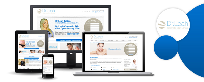
Our latest website is a very special one indeed. If you watch The Apprentice, you'll already know who Dr Leah Totton is - after emerging victorious from the show's most recent series, she founded Dr Leah Clinics in partnership with Lord Alan Sugar.
Now, you may remember that we created a website for previous Apprentice winner Ricky Martin and his company, Hyper Recruitment Solutions. Ricky was so pleased with the HRS site that he recommended us to Leah, and we're proud to announce that the Dr Leah website is now live for all to see! Visit www.drleah.co.uk and have a browse.
Dr Leah specialises in aesthetic medicine, and her brand new London clinic offers all kinds of safe and effective beauty treatments. These range from anti-wrinkle injections and facial fillers (useful if you want to fight those tell-tale signs of ageing) to revolutionary non-invasive liposuction procedures. You'll find all the necessary information over on the new website - you can even book a treatment online!
Here's what Leah had to say about working with Designer Websites:
"Designer Websites came highly recommended to me by former Apprentice winner Ricky Martin, who worked with them on the HRS website. I was impressed by them as a company - they were fantastic throughout the whole process, and they have created a fantastic website. A pleasure to work with, and a company I am happy to recommend to any business seeking a web designer."
- Dr Leah Totton
Thanks for the positive feedback, Leah! The whole team here at Designer Websites would like to wish Leah and Lord Sugar every success in their new venture, and we hope that everyone likes the new website.
Last week we told you about the launch of 'Formula Dragon' - a competition launched by SVG Promotions Limited to attempt to get Welsh citizens involved in motor racing. Formula Dragon aims to make race car driving accessible to anyone over the age of 16 with a spare £30. This fantastic competition also provides scope for individuals to become professional race car mechanics and technicians.
Designer Websites are proud sponsors of Formula Dragon because we think it's a fantastic opportunity to make motor racing more accessible to Welsh citizens and we're keen to see how the work of SVG Promotions Limited impacts motor racing in Wales.
If you fancy yourself as a race car driver, if you love formula one of if you'd quite simply love the opportunity to give it a go, then enter on the Formula Dragon Website and for just £30 you'll be entered into the competition to win an opportunity of a lifetime. Ultimately any successful competitors will compete in the British Touring Car Championship backed by a Welsh team.
Below are a couple of videos from the launch to provide you with more information, but in essence, the message of Formula Dragon is : a chance to drive a real race car for just £30!
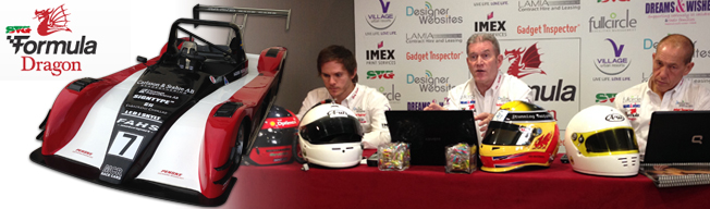
Today Designer Websites attended the launch of Formula Dragon, an exciting new motor sport competition designed to promote and nurture motor sport in Wales with the aim of producing quality BTCC drivers, mechanics and technicians.
Formula Dragon is a motor sport competition open to every resident of Wales who are aged between 16 and 50. The aim is to make motor sport accessible to all members of the public, and provide the opportunity for Welsh citizens to become racing drivers, mechanics or technicians within three levels of UK motor racing. Any successful competitors will compete in the British Touring Car Championship supported by a team of Welsh drivers.
Designer Websites is a sponsor of Formula Dragon, and we jumped on the opportunity to back such a unique cause after being involved with the initial website design. To promote motor sport in Wales and make racing accessible to the public is a niche idea which we think will provide a fantastic opportunity for Welsh people and we’re pleased to have our name on the sponsors list.
The launch was held at the Liberty Hotel in Swansea and an enthusiastic and informative talk was given by members of SVG Promotions Limited, the company behind the Formula Dragon competition. SVG Promotions Limited are responsible for the hit program “So You Want to Be an F1 Driver” aired on Channel Five, Sky Sports and ITV’s Men and Motors, and are hoping to emulate this success with Formula Dragon.
It was great to hear their visions for the future and their intentions to raise awareness of road safety amongst young people in Wales. We had an exciting and interesting day at the launch and can’t wait to see what Formula Dragon holds for the future of motor racing in Wales.
Our latest project to go live is the new website for PMG, a team of commercial property developers operating in the UK and abroad. PMG Group have been responsible for all sorts of exciting developments over the years - our followers here in South Wales will probably be most interested in their contribution towards the development of Cardiff's City Stadium!
We think that PMG do some really great work, turning brownfield sites into residential areas and developing retail parks and industrial utilities that really do make a difference. Their new website is sleek, minimal, and modern-looking - we think it conveys a very professional image, and we hope that the PMG directors feel the same way. To see our latest work, visit www.pmg-plc.com today!