We handle
email marketing for quite a few clients here at Designer Websites - this involves designing each individual campaign and, once the client has signed off on our design, converting and sending the mailer to that client's customer base.
Having done this every week for several years, we now have a pretty good idea of what works and what doesn't when it comes to email marketing campaigns. Here are some top tips from our professional web design team:
- Keep your prime content above the fold. People get a lot of emails nowadays, and if your customers have to scroll down to find out why you're emailing them...well, they won't. They'll delete your message and move on to the next one. That doesn't mean you can't put anything under the fold, but you should definitely put the 'meat' of your mailer right at the top if possible.
- Brand strongly and consistently. You want to make sure that the recipients of your email know who it's coming from. You also want to make sure that, if they click through to your site, the transition from email to web page is as smooth as possible. Consistent branding is essential for both of these goals - make sure your company name and logo are exactly the same in your mailers as on your website, and make sure that they're prominently displayed in both places too.
- Use your best images. If you're promoting products in your mailer, make sure you've got decent photos of them. Images are what make people click, and the better your images are, the better your CTR (click-through rate) will be.
- Don't go overboard. There's always the temptation to cram as many different products and offers into a mailer as possible, but with this sort of thing, less is almost always more. A single clearly-stated, well-presented promotion will elicit a better response from your customers than a confusing, overcrowded jumble.
- Check your landing pages. What page(s) are you linking to from your mailer? Is the content of your email campaign an accurate reflection of the corresponding content on your website? If not, you'll probably see a lot of people clicking through to your site and then leaving right away because they couldn't find what the email promised them.
- Put some thought into your subject line. The subject line is the single most important element of any email marketing campaign - after all, if nobody's interested in your subject line, they won't even bother to open your email and see what you've sent them. Do your best to write something that will grab the attention of your customers without looking too much like spam. Oh, and be sure to triple-check your spelling - nothing will kill the recipient's trust more quickly than a typo in the subject line!
Would you like our professional web design team to handle your email campaigns for you? Click here to request a quote, or give us a call on 01446 339050!
First Encounters Ultrasound is a company that provides private pregnancy scans for expectant parents. They have a state-of-the-art clinic in Cardiff, and are among the UK's leading experts on 3D/4D ultrasound technology.
While First Encounters offer a variety of different scan packages, the company specialise in 4D ultrasound scans, which allow you to get a detailed look at your unborn baby:
We recently designed a
new website for First Encounters Ultrasound, and since then, they've seen a major boost in traffic and enquiries. The new and improved version of their website (
www.firstencounters.co.uk) went live on the 2nd of June 2015; the following thirty-day period saw an
18.79% increase in organic Google traffic. That's almost
800 extra visitors over the course of just one month!
Traffic stats from Google Analytics.
This additional traffic comes thanks to some superb organic rankings. At the time of writing this post, the website now appears on the first page* of Google results for a number of relevant keywords, including 4d scan, 4d pregnancy scan, and gender scan (*please note that Google results may vary based on your location).
Responsive Design & Mobile Traffic
One of the biggest driving factors behind the decision to redesign the First Encounters website was the continuing swing away from desktop computers and towards mobile browsing. The First Encounters team wanted a site that would look good and function well on smartphones and tablets (as well as on larger devices), and our web design specialists rose to the challenge as usual, creating a responsive, user-friendly website that adapts to any screen size:
We are very proud of the website that we created for First Encounters, and sure enough, our efforts to make the site 'mobile-friendly' yielded great results. After the new site went live, First Encounters saw a 66% increase in mobile traffic, and a 27% increase in traffic from tablets:
Stats from Google Analytics.
PPC Advertising: Google AdWords
Once we had completed the new First Encounters website, our
PPC specialists were asked to take over the company's Google AdWords account. Within thirty days, we had increased the site's AdWords traffic by a spectacular
90% (roughly
1,160 extra visitors) - and all
without any change to the company's AdWords budget!
First Encounters received a total of 315 bookings in June 2015 - their highest monthly total to date! Here's what Warren Boulton, the company's Commercial Director, had to say about this outcome:
"As a company targeting a particular audience within a specific demographic, our website is the foundation of our marketing strategy. However, in recent times, it had become increasingly evident that our continued growth and development in both existing and new territories would require an online presence that reflected the changes in SEO criteria, combined with compatibility across the multitude of devices from which our site is accessed.
"In response to these demands, Designer Websites have developed a fully responsible website that provides clear functionality across all platforms, particularly the mobile and tablet devices that our clients commonly use. The search engine optimisation used in conjunction with this design has enabled us to achieve the #1 in many Google organic listings within one month, and their continued support with social media and news blogging further assists with this cause.
"The Designer Websites team are friendly, professional, and extremely knowledgeable, delivering results in a timely manner and providing a highly commendable service from an extremely trustworthy organisation."
Can we help your company to succeed online? Would you like us to create a mobile-friendly website for you, or manage your AdWords accounts? Whatever you need, you can get a quote here.
The internet is always changing, as are the rules and standards of web design. What looked fantastic five years ago will probably look very outdated today, and we are frequently asked to redesign our clients' websites to help them stay current and impress the current generation of web users.
Howard G Davies recently asked us to refresh his website, which was beginning to look a little bit tired by 2015 standards. As usual, our design team rose to the challenge, combining a bold blue-and-white colour scheme with carefully-chosen images and a simple, eye-catching layout to ensure that the revitalised website would look bang up to date.
Howard G Davies & Associates are a team of safety consultants specialising in fitness equipment, which means that they inspect exercise machinery before it is distributed and sold. They also help gym owners to ensure that their premises are as safe as possible, and in the event of a fitness-related accident, Howard and his team can serve as expert witnesses during any proceedings that follow.
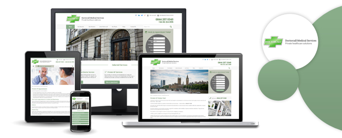
With two state-of-the-art clinics and such famous names as Dr Christian Jessen on the staff, Doctorcall are undoubtedly among of the UK's very best private healthcare companies. While based in London and Manchester, Doctorcall do operate throughout the country, and they recently asked us to create a new website that was worthy of their nationwide renown.
To do this, we had to condense Doctorcall's long list of services - ranging from home visits to flu vaccinations, STI tests, and Botox injections - into something manageable and easy to navigate. In this respect, we believe that we have succeeded; the new site looks clean and professional, and its straightforward responsive design makes for a fantastic user experience, even on smaller screens.
The real challenge of this project was the website's multi-faceted nature; at first glance, Doctorcall.co.uk looks like a simplistic brochure website (albeit a relatively advanced one), driving users to make enquiries and appointments using a built-in booking form. However, the site also contains ecommerce elements, enabling users to purchase a variety of home testing kits, cosmetics, and other Doctorcall products online. Additionally, we had to make sure that the site would be able to support Doctorcall's occupational health services; flight attendants, offshore oil workers, and many other professionals are required to undergo a medical examination before commencing work, and so we added a series of more specific forms to the website for people who might need to book an occupational health check with Doctorcall.
The Doctorcall website is fully integrated with an advanced clinic appointment booking system called Qinec. This integration allows patients to seamlessly book appointments online with the chosen clinic and doctor.
Overall, we feel that the Designer Websites team overcame all challenges and produced a great-looking, highly functional website. As mentioned above, the new site is fully responsive and very easy to use - click here to visit it for yourself, and feel free to let us know what you think.