Mobile-friendly site copy

Last month, Google issued an ultimatum to webmasters the world over: make your websites mobile-friendly before April 21, 2015, or we'll stop showing you in our mobile search results. You can read the official announcement on Google's blog; search experts have nicknamed the promised algorithm change "the mobile SEO-pocalypse", and with that mid-April deadline now less than a month away, innumerable business owners are scrambling to make their sites look good on smaller screens so as to avoid losing their Google traffic.

Now, we're not here today to give you responsive design hints - the internet is already packed with articles explaining how to make your website 'mobile-friendly', and if you want our help, you can request a quotation here. However, we have noticed one potential issue that few others seem to pick up on, and it concerns your website's text.

You see, when web designers create a new design for an old website, they will often just copy and paste the old site's copy into the new design. This approach can create some problems for the end user, even if the information within the text is up-to-date. Here's a fictional example:

  • Alice is an interior designer who owns her own business. She has a brochure website - let's call it aliceinteriors.com - that she uses to drive enquiries. Would-be customers fill in a contact form on the website, and Alice calls them up to discuss their requirements, quote prices, and so forth.

  • Alice has heard about Google's upcoming algorithm change, and she wants to make her website mobile-friendly before April 21 to make sure she doesn't lose any business. She hires a local web design company to create a new responsive design and optimise the site for mobile users.

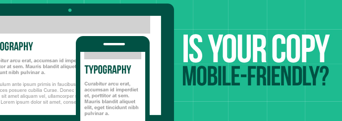
  • A responsive website is effectively several different website designs in one, and aliceinteriors.com will now look different depending on whether Alice views it on a PC or on a smartphone. For instance, the site menu will likely be represented by the ubiquitous hamburger icon on smaller screens, and certain elements of each page may appear in different positions across different devices.

  • While looking at the mobile version of her website, Alice notices an issue: the text on her homepage tells users to "Fill in the form on the right", but in the mobile view, Alice's all-important enquiry form is placed directly below the text in question.

This imagined scenario is just one example. Broadly speaking, any written reference to site layout ("Click on the link below", "Select an option from the menu above", etc.) becomes problematic - if not outright misleading - when placed within a responsive design. Unless you and your web designer can find a way to ensure that certain items remain static across all views, it may be better to remove any such phrases entirely and find other ways to draw attention to your website's key elements.

Either way, there's an important lesson to be learned here: when optimising your website for mobile users, be sure to read through your site's text in each different view to make sure that you aren't confusing people with smartphones!

Mobile Ecommerce

More and more people are using smartphones - instead of desktop computers - to browse the web, and as mobile internet usage increases, so too does the amount of money spent online via mobile. In fact, shopping is one of the most common things that people do with their phones nowadays; this Econsultancy report suggests that 24% of mobile internet users have made purchases using their phones, and since that figure was just 20% back in 2013, it's probably safe to assume that smartphone shopping will continue to get more and more popular as time goes by.

If you have an ecommerce website, these statistics are not to be ignored. You have probably already noticed a swing towards mobile traffic on your site, and all the facts suggest that this trend is going to continue, so it's very much in your best interests to take a good look at your site and ask yourself how well-optimised it is for smartphone users.

If you want to turn your mobile visitors into mobile customers, here are three tips for giving them a better experience and boosting your mobile conversions:

It's a small screen - don't clutter it up!

The most obvious difference between mobile phones and desktop PCs is the screen size. When you're thinking about how your website should look on a mobile phone, be sure to make the most important elements instantly and clearly visible - this may mean stripping back the less essential parts of each page (such as promotional banners and unnecessary text) so as to fit everything in without making it hard to read. If users are having to scroll back and forth and squint at their screens just to find what they're looking for, there's a pretty strong chance that they'll give up before they reach the checkout.

Speed is everything!

This mantra doesn't just apply to loading times (although these are obviously critical on any device); it also applies to the user's journey through your site. Bear in mind that mobile users often have limited time to spend on your site, particularly if they're on a train or in the loo (you may laugh - 75% of people admit to doing it!)

If you want users to be able to fit a transaction into this short window of time, you need to make the whole process as quick as possible. If your site doesn't already use PayPal, consider adding it, as this will save a lot of users from having to painstakingly enter their payment details. An 'express checkout' option can also help - is it really worth forcing new users to register for an account before purchasing? Some will do it, but many will simply go elsewhere.

More generally, it's a good idea to go through each step of your site's buying journey and note down any steps that could be streamlined or removed - remember, each step is another opportunity for your customer to change their mind and leave the site!

Keep payment simple

We've already mentioned PayPal, but that's not the only way to make payment that little bit less painful for your customers. Another important difference between smartphones and PCs is the lack of a mouse or keyboard, and this can make entering one's details on a mobile extremely fiddly. Make sure that the data entry boxes (card number, customer name, etc.) are of an easily-clickable size, and try not to include too many of them (do you really need their address, their telephone number AND their email address?)

Some more quick tips for the checkout page:

  • Instead of forcing everyone to enter their addresses manually, use an address lookup system that allows users to enter a postcode and select the correct address from a drop-down list. This cuts down on the amount of typing required to complete a purchase.

  • Make your delivery options as clear as possible. If, at a glance, people don't know a) how soon their items will arrive and b) how much it will cost, they'll be reluctant to go through with the purchase.

  • Are there boxes to tick? If users have to tick a 'Terms and Conditions' box at the checkout, make sure it's nice and big - that way, they won't miss it, and it'll be easy to click on!

 Want to make your site more mobile-friendly? Why not consider upgrading to a responsive design?

There was a time when people could only access the internet on a PC, but those days are well and truly behind us. In this day and age, the humble desktop computer is just one of many, many different ways in which we can get online, and your customers are now just as likely to see your website on a mobile phone as on a proper computer.

This could well be a problem for you. Just because your company's website looks great and functions perfectly on a PC doesn't mean that it will work just as well on a smartphone; in fact, if the site wasn't made with mobile devices in mind, there's a very strong chance that it will be next to unusable. Smartphone usage is going up every day, so simply ignoring your mobile traffic won't be a viable option for long - you'll either have to find a way to give those visitors a good user experience, or face the fact that you're going to lose them to a competitor who was prepared to make that extra effort.

Once you've decided to make the leap to mobile, there's another big decision to make: do you create an app for your business, or plump for a responsive website that will look good on screens of any size? This is a hotly-debated topic, and we at Designer Websites couldn't resist throwing in our 2p. Here are some pros and cons:


Mobile App

Pros:

  • Stays with the user, remaining on their device after download
  • Designed specifically for mobile - no need to change the desktop version of your site
  • Can incorporate 'push notifications' to keep the user coming back

Cons:

  • Download required (demands more commitment from the user)
  • May be hard to find in the App Store (what does your business share its name with?)
  • Your website will still look poor on mobile devices
  • No search engine presence


Responsive Website

Pros:

  • Attractive, user-friendly, and consistent across all devices
  • SEO-friendly (your business is more likely to appear in search results)
  • No download or commitment required from user (unlike apps)

Cons:

  • Less permanent than an app - doesn't stay with the user
  • Requires a redesign of your current site


So which is the right choice? To be honest, it depends on your business and what you're trying to achieve. For our part, though, we'd always recommend a responsive site over an app, simply because it ensures that all users are seeing the same information and getting a consistent user experience. Click here to learn more about responsive design, or click here to get a quote for a responsive site of your own.