Tag: website-design


Selecting a colour scheme for your company's website can be a tricky business - you ideally want something that not only looks good but also accurately reflects your brand and the work that you do.

In order to select the right combination of colours for your business, you need to have some understanding of colour meanings and the feelings that different hues evoke. Here's a rough guide to some common colours and what Western audiences tend to associate them with - which of these descriptions most closely resembles your organisation?

Red

Commonly associated with: love, passion, intensity, aggressiveness, action, danger

Red is the colour of danger - motorists see it every day on road signs and traffic lights, and it usually serves as a warning or an urgent instruction. Yet it's also associated with love and romance: think red hearts and red roses.

Red is a very attention-grabbing colour, and many websites use red sparingly to make one particular element (such as a call to action or a key piece of information) stand out above everything else. It is also commonly used in our neck of the woods to emphasise the company's close ties to Wales.

Blue

Commonly associated with: calmness, clarity, relaxation, understanding, imagination

Blue is a calm, relaxing colour that may be a good choice if you want people to feel at ease while browsing your website. It also carries implications of knowledge and an absence of limitations (you may be familiar with the phrase 'blue-sky thinking').

Blue is reportedly the most popular colour on the Internet. Famous blue websites include Facebook, Twitter, and Wordpress, and many companies from all kinds of different industries use blue in their branding to suggest efficiency, clarity, approachability, and connectedness.

Yellow

Commonly associated with: happiness, energy, warmth, light, success

Yellow evokes sunshine and summertime - it's the colour of happiness, so if your company is all about making people happy then this could be a sound colour choice for your website design. One of the most ubiquitous logos in the world - the McDonald's 'M' -  is yellow, and that particular brand is entirely built around themes of joy, happiness, and customer satisfaction (just think of their motto: "I'm lovin' it").

Yellow's other connotations include energy (think yellow lightning bolts) and success (gold medals), so it's perfect if you want to present your brand as energetic, customer-focused, and determined to succeed.

Green

Commonly associated with: nature, the environment, hope, peace, good luck

More or less everyone understands the connotations of the colour green - even the word 'green' has long doubled as a synonym for 'environmentally-friendly'. If you want to bring your company's environmental credentials to the fore, or if you want your corporate branding to evoke the wholesomeness and harmony of nature, then you might want to think about incorporating some green into your colour scheme.

Orange

Commonly associated with: enthusiasm, creativity, determination, affordability 

Orange can be thought of as a somehwat friendlier alternative to red. It's still bright and eye-catching, but it doesn't have the same associations with danger and aggression. Orange tends to make people think of enthusiasm and creativity, making it a good choice if you want customers to view you as an eager organisation that's good at thinking outside the box.

Purple

Commonly associated with: glamour, power, royalty, luxury

Purple is the colour of monarchs; it makes people think of crowns, thrones and expensive jewellery. If you want to evoke glamour and luxury then purple may be the way forward - it suggests that you offer the most delux, high-end version of the product or service in which you specialise.

Black

Commonly associated with: professionalism, seriousness, wealth

This is an obvious choice for businesses who provide a service related to dying or mourning - funeral directors and bereavement counsellors, for example - but black isn't just the colour of death. It also evokes professionalism; businesspeople often wear black clothes and black shoes to look professional at work and in meetings, and this logic can be applied to corporate branding and website design as well.

Black says that you're serious about what you do, and it can also carry some of the same connotations as purple (specifically opulence and wealth - many luxury brands, including Rolex and Chanel, have bold black logos, and being 'in the black' means that you are financially solvent as opposed to being 'in the red'). 

Pink

Commonly associated with: sex, sweetness, femininity, love, nurturing

Pink and purple are both shades of magenta, and so this colour is sometimes used as a lighter, friendlier and/or 'cheaper' version of its darker counterpart. Pink still suggests a level of glitz and glamour, but it's less a night at the opera and more a night at the musicals. If purple is Madama Butterfly, then pink is Grease or Mamma Mia!

Obviously, pink is frequently used as a shorthand for femininity, and it's common to see it used on websites that specifically target women and/or girls. Pink is also the colour of sexuality, making it not just an appropriate colour for businesses of an adult nature but also a great way to subtly trigger the primal part of the brain that drives us to seek out sexual partners and reproduce.

Brown

Commonly associated with: dependability, earthiness, authenticity, tradition

Brown, like green, is a colour that's often associated with Earth and with the world around us. It suggests unrefined, non-manufactured authenticity, and it can be used to evoke environmental friendliness as well as personal health ('brown' foods such as brown bread and brown rice being seen as healthier than their 'white' equivalents) and a general sense of doing the right thing.

Brown also has strong ties to the past, and can be used by brands to play upon the consumer's desire for something traditional or old-fashioned. If you want to use nostalgia to persuade people to use your company, brown may be an effective colour choice both for your logo and for your website design.

Need help choosing the right website design for your business? Designer Websites can help - click here to request a FREE web design quote!
Does the Fold Still Matter?
 
The last few years have seen some major changes in the way people consume information online. Most notably, mobile devices are now the most popular means of browsing the Internet, and that's a fact that web designers cannot afford to ignore: if your client's customers would rather shop on their smartphones than on desktop PCs, then you're making a huge mistake by designing primarily for full-size screens.
 
One big debate that's popped up as a result of the mobile revolution concerns the fold and whether it's still a useful concept for web designers to bear in mind. Today, we're going to take a closer look at this issue and find out if the fold still matters in a world where most people view the internet on mobile devices.

What is the fold?

When you first arrive on a webpage, the fold is the line that separates the stuff you see right away from the stuff you don't see until you scroll down. If content is 'above the fold', it's visible from the moment the page loads; content that's 'below the fold' is not visible until you scroll further down the page.

How do we know where the fold is?

Back when desktop PCs were the only option for people who wanted to surf the web, it was fairly easy to identify whether a given piece of content would be above or below the fold, because you could assume that your website would look more or less the same on every monitor. It's trickier nowadays because internet-capable devices come in all kinds of different shapes and sizes: content that's above the fold on a laptop may be way, way below the fold on a smartphone or tablet.
 
Unfortunately, it's not even as simple as a desktop/tablet/mobile trichotomy, because different phones and tablets often have vastly different screen sizes (for example, the fold is unlikely to be located in exactly the same place on both an iPhone and a Samsung Galaxy). Shrewd use of responsive web design techniques will ensure that your website looks good and functions well on every device, but this doesn't change the fact that parts of your homepage will be above the fold on some screens and below it on others.
 
But is this a problem? That's the question we're really here to answer today: should you be worried when a critical piece of content falls below the fold, or has the entire concept of the fold become outdated and irrelevant?

Here's why the fold isn't as important as it used to be

The argument against the fold having any bearing on modern web design hinges primarily on the idea that present-day web users are happy to scroll down in order to find what they're looking for. And when you think about this, it makes sense: smartphone screens are relatively small, and it's rare to see a webpage that fits the entirety of its content into that limited space. When you read a news article on your phone, for example, you often can't see anything beyond the headline until you scroll down a little.
 
As we mentioned earlier, the majority of Internet use now takes place on mobile devices, and as a result, there's really no reason to be afraid of forcing your users to scroll down any more. Unlike the PC owners of yore who didn't even have mouse wheels, mobile users generally don't mind scrolling to reach the meat of your webpage; in fact, their daily online experiences have arguably conditioned them to expect it. Whether you're scrolling through your Twitter feed, a Spotify playlist, or a list of products on an ecommerce website, it's plain to see that scrolling, not clicking, has become our primary method for interacting with the Internet. Heck, you've probably seen at least one website that consists of just one page and is navigated simply by scrolling through the entire thing.
 
(If you haven't come across a website like that before, www.tacklestore.net is a good example - note that clicking an option in the header menu simply causes your browser to auto-scroll straight down to the relevant portion of the page.)
 
So, given that your customers' thumbs will be poised to start scrolling as soon as your website loads, there's no need to worry about the fold at all, right? Even if your Enquire Now > button is buried all the way down at the very bottom of the page, all those hours spent flicking through Facebook posts have left people perfectly content to scroll more or less infinitely, yes?
 
Well...not necessarily.

Here's why 'above the fold' still matters

While the fold is no longer a Bermuda Triangle-esque vanishing point for user engagement, it's still important to think hard about what's at the very top of your webpage. It's true that most users in this day and age don't mind a spot of scrolling, but you have to give them a reason to scroll or they'll just go away and visit somebody else's site instead. And when Google spots that its users are consistently leaving your website almost as soon as they've arrived, your rankings will disappear faster than the last bacon-wrapped sausage on Christmas Day.
 
The key here is to think about your website from the perspective of a hypothetical user. Look at your page on a variety of different devices (desktop, mobile and tablet) and ask yourself these two questions:
  • Is this what the user will be expecting to see? If your website sells laptops, and you're primarily targeting people who want to buy laptops, then the topmost thing on your homepage should NOT be a blog post about how to use Google Docs. It may be a brilliant, insightful read, and it may even be of interest to some of your customers, but the main reason they're on your website is to shop for laptops. Your above-the-fold content should first and foremost aim to welcome users to the page and confirm that they're in the right place.

  • Are we giving the user a reason to take further action? Reassuring the user that, yes, your website is the one for them is half the battle. The next thing you have to do is encourage them to take action. That doesn't have to mean buying something or telephoning your sales team, at least not right away. But while it's no longer necessary to place your main call-to-action at the top of your page, you at least need to entice the user to go further with their investigation. The first thing users see on your site should be something that makes them want to read more, or click through to view some examples of your work, or follow you on Twitter because you're clearly the greatest wit of your generation. Be sure to bear this in mind when you're thinking about your above-the-fold content.

Examples

Here are a couple of websites that, in our opinion, have managed to get their above-the-fold content just right:
 
 
Access Training Academies
 
This company delivers accredited trade training courses across the UK.
  • Is this what the user will be expecting to see? Yes - the heading immediately confirms the company's name and gives a rough summary of what they do ("Electrician Courses, Plumbing Courses & More"). Whether the user was specifically looking for Access Training Academies or simply researching potential training providers, the above-the-fold content makes it clear from the off that this site has what they're after.

  • Does this give the user a reason to take further action? Again, yes - the 'Course Finder' tool makes it easy for budding tradespeople to find the area they're interested in and skip straight to the relevant course(s). The telephone icon that appears in the top-right corner of the page when it's viewed on a mobile device also makes it apparent that customers can contact the company directly if they require any assistance.
 
Floormaker.co.uk
 
This is an ecommerce website with a wide variety of flooring products on offer.
  • Is this what the user will be expecting to see? Almost certainly - there's confirmation that Floormaker is a "flooring supplier" directly under the company's logo, and references to the likes of laminate and solid wood flooring give customers further reassurance that this website is likely to feature the type of product they're after.

  • Does this give the user a reason to take further action? Yes. Visitors to the Floormaker website are presented with several options right off the bat: browse the laminate or solid wood ranges, use the search bar to find something specific, or use the live chat software to speak with someone who knows what they're talking about. Note also the icons underneath the search bar (free samples, free delivery, 5 star reviews, etc.), which offer the user some very good reasons to stick with Floormaker and investigate the company's website further.
If you'd like a business website that's designed by professionals with a firm grasp of all the latest web design techniques, please call Designer Websites on 01446 339050 or click here to request a quotation.

ABC Leasing are a team of car leasing specialists based in South Wales. They provide vehicles for personal use as well as for professional purposes, and they pride themselves on providing great customer service and making the leasing process as fast and as hassle-free as possible for their customers. 

One of ABC's main aims is to provide a straightforward and transparent service, making it easy to apply for a lease and to find the information needed to make an informed decision. With this in mind, they became concerned that their website was somewhat outdated and difficult to use, preventing them from giving their customers a truly user-friendly experience. This is why they decided to get in touch with Designer Websites with the the goal of creating a sleek new website that would be easy to use and comprehend. They also wanted to improve their website's search engine optimisation, in order to attract more business via Google and other search engines.

Our developers worked closely with the team at ABC to create a modern and user-friendly website, with a variety of helpful features that were custom-built to meet their aims. A primary goal for the new design was to ensure that customers were able to browse and search the full range of vehicles with ease, allowing them to select their desired car or van online. To make this as simple as possible for site users, we developed a sophisticated search system that allows users to refine their search by make, model, vehicle type and budget, granting them the ability to add or omit these specifications according to their preferences.

As well as improving the search function on their website, ABC were also keen to make the application process as straightforward as possible, enabling customers to apply for a lease without having to visit the ABC office in person. Their new website's online application page makes it simple and stress-free for users to apply for a lease on any device, thanks to the responsive design, which ensures that the information is presented on smartphones and tablets in an easy-to-navigate format. There is also an additional enquiry form for people who would like to find our more about ABC before making their decision, allowing them to target undecided customers as well as those who have already chosen to commit.

To view the new and improved ABC Leasing site, please visit http://www.abc-leasing.com/

If you would like to discover how an improved website could enhance your business or organisation, please get in touch with Designer Websites to discuss your requirements.

Recently we were approached by Access Training Academies, a trade qualification course provider who were interested in improving the usability and search engine performance of their website.

Access Training offer some of the best trade courses in the UK, giving students the opportunity to gain practical experience in a large number of fields, ranging from plumbing to plastering. With state of the art facilities, and a concentrated 1-8 tutor to student ratio, Access Training are able to offer an efficient and highly successful set of teaching programmes to their candidates. 

Hoping to reach out to potential students and aid their location of suitable courses once they had reached their website, Access Training asked us to improve the site's visual and technical aspects, thereby increasing its overall performance and quality.They began, by deciding that they wanted to make the site fully accessible to people who were using devices other than a desktop computer to search for their courses. We achieved this by ensuring that the new design was fully responsive across a number of portable devices, allowing excellent navigation regardless of screen size.

This user friendly nature has been extended throughout all aspects of the site, and is particularly noticeable in the new 'course finder' wizard, which allows visitors to find suitable courses with ease and efficiency. This is directly related to the site's improved copy, which has been condensed to provide easy comprehension and better search engine performance by targeting specific keywords. We've already seen some improvements in their Google rankings since the site went live, and we are sure that this is something that will see continued improvement over time.

Visit the new Access Training Academies website now, or get in touch to find out more about our services.
Bespoke website design

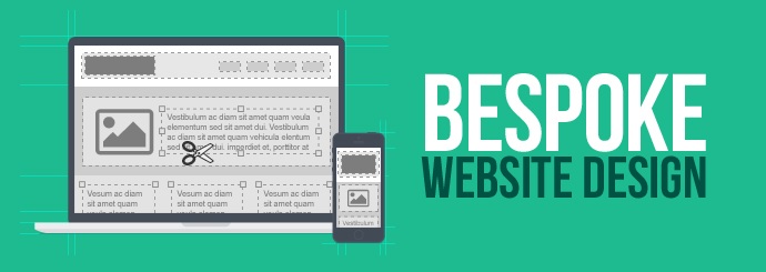
Here at Designer Websites, we offer a bespoke web design and development service that provides our clients with unique and highly functional websites. Our work is scalable and fine-tuned to each client's needs, and every website we create is designed to offer the best possible user experience.

Whether your aim is to generate a strong and memorable brand identity for your new company online, or to offer unique functionality to your customers, there are myriad benefits that come from investing in a bespoke website.

One question we're often asked by clients who are thinking of commissioning a bespoke website is...

"What makes a bespoke website better than a template-type site that's based on a pre-built system?"

On first impression, pre-built solutions can seem like a great idea for businesses who are just starting out online. Accessible and affordable, they are the 'quick fix' of the web design world - there are lots of shortcuts one can take to get a website up and running in a short time, allowing the user to build their design based on a set of ready-made foundations.

While the popularity of pre-built systems is undeniable, what we'd like to do in this article is highlight some of the drawbacks - drawbacks that arguably far outweigh the benefits.

Read on to learn why a bespoke web design will deliver a more sustainable, professional advantage to you and your business in the long term.

Exclusivity and Customisation

As mentioned above, a template on a pre-built system can seem like a perfectly adequate choice for your website at first, especially as you can often choose from thousands of available designs to make the finished site feel unique. The fact that it's pre-made also means that you can test your site to see how it will look for the user once you have uploaded all the content. There is very little design or development time required, and therefore the cost should be very low indeed. In fact, many of these DIY-type solutions allow you to build a site yourself (even if you would need to be relatively web-savvy to achieve this).

Sounds OK so far, right? So what are the drawbacks?

A Unique Design...?

Some of these pre-built website solutions offer thousands of different template designs, with new ones becoming available every day. But there are hundreds of millions of websites online, and over time, those templates become less unique as more people choose to use them.

Of course, many of the templates can be tweaked with different colours, images, and so on, making them more specific to your company and your requirements. But you can only go as far as the template will allow you.

With many pre-built systems, you can use a totally bespoke design on top of the platform, which will give you some uniqueness for a while (though, again, only within the constraints of the system's capabilities). The problem is, these systems are designed to be easy to replicate, and the code structure is always the same - so your design will not be unique for as long as you might like.

If you use a decent designer to create a template on top of a pre-built system, then you may well end up paying over the odds for what is fundamentally a template system - and all without gaining any of the benefits of a bespoke website. It's important to be caution here: these web designers may say they're selling you a 'bespoke website' (they may even believe it themselves), but in fact it's only a bespoke design within the rigid structure of a template system.

Moreover, we often see companies charging ridiculous fees for what is simply a design - work that's made relatively easy for the designer by the confinements of a pre-built system. This is not a bespoke website.

Responsive vs Emulated Responsive

A truly responsive web design starts with the user interface (UI) designer, who should spend time creating separate designs for each device type - i.e. mobiles, tablets and desktop PCs. The designer will carefully think about the user journey on a smartphone, for example, excluding sections and including the most relevant areas, making the point of the website more appropriate for that type of user in that situation. It may be a totally different layout to that seen on a desktop monitor. Along with this comes the usual menu style changes and resizing of images, etc.

An emulated responsive design, often employed by pre-built solutions or templates, is one where the system makes automated calculations based on the size of the screen and changes the style of the menu and resizes elements like images and fonts on the screen. So it's the same design/layout, but adapted to the screen size.

Emulated responsive is better than not having a responsive design at all, but this does not give the user the best experience, and does not sell your business or your products in the best way.

Bespoke, truly responsive websites are naturally far better than emulated responsive sites, so be sure of what your web designer is offering you - ask them if it's 'true responsive' or just emulated.

Expertise

Problems can arise when you ask your web designer 'can we make it do this? and the answer is often an intake of air and - surprise, surprise - either 'no' or 'we can do it for the cost of a small car'!

The reason for this is that they are not proper software developers (although don't tell them that because they probably think they are) and fundamentally, they did not develop the system. They have merely placed the design on top of an existing system, so it's actually pretty tough for them to do what you are asking without outsourcing to a software development company.

A truly bespoke website will be modern, totally unique, scalable, delivered by the people responsible for the coding and not just the design, and fundamentally if you need a change it is often very easy and quick, but most importantly very doable!

Truly bespoke websites are delivered by companies with a combination of professional software engineers, user interface developers and highly skilled web-specific designers. These tend to be far more stable companies and not your fly-by-night very small design-only firms, so an additional benefit is that you don't have to worry about your website disappearing one day!

Some large companies take the view that pre-built solutions are a very fast way of making easy money, and therefore still deliver them. Sadly, these tend to be the companies who charge the same as a bespoke development company would for a truly bespoke website, but instead they deliver to you a pre-built template system at an extortionate price! It's a very fast way to make money if you can sleep at night with this kind of business model...

So are bespoke websites more expensive? Well, they most definitely should be, because they require highly skilled and experienced people to develop them, but, quite often they are not more expensive at all! In our experience, they are sadly often cheaper than the pre-built templates systems, because some unscrupulous companies charge a great deal for placing a design on top of a pre-built solution.

Code Age & Technology

One of the biggest problems with pre-built solutions is that they cost the founding company a great deal of cash to develop, as they try to create a one-size-fits-all type solution. This then leads to them needing to sell that solution over and over for many years to claw back their costs. In turn, this often means that the pre-built solution being sold to you is 5 to 10 years old (or worse) based on old technologies and techniques, albeit its existence in an ever-changing technological world!

A bespoke website will be developed with the very latest technologies, available online techniques and scripting functionality, and there is significant benefit to this online, not least of which is the search engine optimisation benefits.

Expansion and Optimisation

One of the most significant limitations posed by template systems is the inability to expand and improve your website over time. If you want to say integrate your Sage accounts, your ERP system, CRM or barcoding system, etc, this can often be made overly-complicated or even impossible!

Plugins are often available within open source pre-built solutions, which are intended to offer the user the ability to extend the possibilities set out in a template, these can soon prove to be unreliable, insufficient, bug riddled and even highly insecure. Developed by third parties, these plug-ins could not only clash when used in combination with other plug-ins, but also with general system updates across the template platform. This puts the user in a lose/lose situation, due to the fact that while an update may affect the freedom granted by these additions, neglecting to conform to system updates could increase the chances of your site's security being compromised (actually a common problem with templates). These plugins can not only compromise security and reliability but are often not optimised and therefore contain unnecessary code, making the system sluggish and unresponsive.

As far as online optimisation is concerned, your website should be light, fast and responsive to the user, making it easy to use. You want to offer your customers a speedy and useful journey through your website, and this too is what the likes of Google want. They don't care about you or your business, they only care that the website they are affectively recommending is providing a useful experience. After-all, if they constantly linked to slow and poor quality websites, then we'd all stop using them to search for things on the internet right?

The problem with a one-size-fits-all system, is that it lends itself to providing quick and easy solutions, meaning that you don't need to be very skilled or experienced to provide one, again meaning that the site will not be properly optimised. These systems contain lots of bolt-on's and plugins to handle newer technologies that didn't exist when it was created 10 years ago, which just adds to the slowness and the bulkiness. Add to this the inherent security issues which arise with these systems, and you have to wonder why they sell so well.

Support and Security

As I have already mentioned above, template websites can cause serious problems when it comes to security, simply due to the fact that they present an attractive target for hackers. If you own a bespoke website, then hackers would need to target it specifically and run lots of tools to find out where the admin area is, where the database is stored, etc. This makes the process far more time consuming, and therefore less appealing. Template websites tend to have the same admin login area, the same database location and the same codebase etc, so they are very easy to hack. As part of a wider network of replicated sites, they form a super easy target once a vulnerability has been identified.

No website is safe from a really good hacker, all you can do is provide as much security as possible and make it more time consuming for them; if a good hacker wants your information they'll get it! If they can get into military instalments or FBI systems, then they can most definitely get into your website if they really want to. The point is, why would they waste their time trying to get into a relatively secure and obfuscated website, when all these template type sites exist on the internet? These pre-built solutions make it easy for them, and the designers developing them actually know very little about the technical security of a website in the first place.

In fact, an inherent security issue is posed by the fact that many of these systems are open source, and provide free plugins. If you want a widget within your website to perform a specific task, you can simply look online to see if someone has created a plugin for it. Often you will find it has been done and most of the time these will be fine, but how would you or your designer know if that plugin had some backdoor access type code hidden within it, or keyboard tracking, or a million other security risks? Bear in mind that your designer didn't write the code, and more than likely wouldn't understand it even if they did try to read it.

Another disadvantage of using a template is the lack of support when things do go wrong, like some of the issues I have mentioned above. If you discover a problem with your website, without the proper expertise it can be very difficult to diagnose and fix.

So, in summary, a bespoke website will have the following benefits:

  • Truly bespoke design - not easily replicated
  • A true responsive design - not emulated
  • A proper development and design team for support and assistance
  • More modern and technologically advanced code
  • True scalability and the ability to integrate any online technology as it becomes available
  • Security from common vulnerabilities
  • Importantly, an optimised solution that is light, fast and responsive
  • And lastly...value for money! We're not simply pushing a design onto a pre-built solution and then charging you the price of a small car for doing so!

We're happy to answer any questions you may have on this subject, if you do have any further enquires, please don't hesitate to get in touch.

Request a Website Design Quote