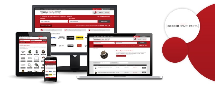
Your website should be as user-friendly as possible no matter what field you're in, but that user-friendliness becomes even more crucial when you work with something as technical and as complicated as cooker parts. Cooker Spare Parts is a Cardiff-based enterprise specialising - as the name suggests - in replacement cooker parts, and we have just completed a brand new website design for them.
Now, there are literally thousands of different items that you can purchase through Cooker Spare Parts; in all our years developing ecommerce websites, this may well be the largest product database we've ever worked with. Factor in the very real possibility that the average CSP customer may not know exactly what they are looking for, and things start to get very complex indeed - even if you know your cooker's brand (e.g. Rangemaster), you won't necessarily know the specific model number, and this is the information that companies like CSP need to give you the correct part.
Clearly, this project would be a big challenge, but we're pleased to say that we have well and truly conquered it. Upon arriving at the new Cooker Spare Parts home page, users are prompted to enter their appliance's manufacturer and model number right away, therefore eliminating as much ambiguity as possible right off the bat. Once this is done, the site ONLY displays parts that are suitable for that specific cooker, ensuring that the customer purchases exactly the right item.
Aside from the improved user interface, we also gave Cooker Spare Parts a sleek new design. The site is now fully responsive, allowing people to order replacement parts with ease on any device at all. The crisp, clear page layout ensures that the user knows exactly what (s)he is seeing at any given stage of the buying process, and we feel the red and white colour scheme looks very sharp and modern. Visit cookerspareparts.com now to see our work for yourself!
There was a time when people could only access the internet on a PC, but those days are well and truly behind us. In this day and age, the humble desktop computer is just one of many, many different ways in which we can get online, and your customers are now just as likely to see your website on a mobile phone as on a proper computer.
This could well be a problem for you. Just because your company's website looks great and functions perfectly on a PC doesn't mean that it will work just as well on a smartphone; in fact, if the site wasn't made with mobile devices in mind, there's a very strong chance that it will be next to unusable. Smartphone usage is going up every day, so simply ignoring your mobile traffic won't be a viable option for long - you'll either have to find a way to give those visitors a good user experience, or face the fact that you're going to lose them to a competitor who was prepared to make that extra effort.
Once you've decided to make the leap to mobile, there's another big decision to make: do you create an app for your business, or plump for a responsive website that will look good on screens of any size? This is a hotly-debated topic, and we at Designer Websites couldn't resist throwing in our 2p. Here are some pros and cons:
Mobile App
Pros:
- Stays with the user, remaining on their device after download
- Designed specifically for mobile - no need to change the desktop version of your site
- Can incorporate 'push notifications' to keep the user coming back
Cons:
- Download required (demands more commitment from the user)
- May be hard to find in the App Store (what does your business share its name with?)
- Your website will still look poor on mobile devices
- No search engine presence
Responsive Website
Pros:
- Attractive, user-friendly, and consistent across all devices
- SEO-friendly (your business is more likely to appear in search results)
- No download or commitment required from user (unlike apps)
Cons:
- Less permanent than an app - doesn't stay with the user
- Requires a redesign of your current site
So which is the right choice? To be honest, it depends on your business and what you're trying to achieve. For our part, though, we'd always recommend a responsive site over an app, simply because it ensures that all users are seeing the same information and getting a consistent user experience. Click here to learn more about responsive design, or click here to get a quote for a responsive site of your own.
Hyper Recruitment Solutions is the recruitment business that is co-owned by 2012 Apprentice winner Ricky Martin and business magnate Lord Alan Sugar. HRS specialise in science and technology; they help employers from within these sectors to recruit bright new talent, and they enable talented jobseekers to find rewarding work in such fields as biotechnology, pharmacy, and engineering.
We have been working with Ricky Martin and HRS ever since the business was founded - the company's website, www.hyperec.com, was designed and developed by the team here at Designer Websites. A few weeks ago, Ricky asked us to make his website more mobile-friendly; like many of our clients, he had decided that it was time to go responsive.
The new and improved HRS website is now live, and we hope that Ricky and Lord Sugar are as proud of it as we are. The site is now fully responsive, which means that it displays differently on different-sized screens. This makes it much easier to navigate on smartphones, tablets, and other mobile devices; with more and more people swapping their desktop PCs for iPads and Androids, this is a crucial consideration, and we are confident that the HRS site's many mobile users will be more than satisfied with its new responsive design.
Browse HRS Science Jobs > Get a Web Design Quote >
With offices in both Cardiff and London, Liberty Marketing are an award-winning agency with a great track record. They offer a range of digital marketing services, from copywriting and search engine optimisation to social media management and pay-per-click advertising. They've helped hundreds of businesses - large and small - to find their feet online, and their brand new website will surely help them to reach even more clients.
The new Liberty website went live yesterday, and it's another great example of our talent for responsive web design. If you'd like to take a look, the URL is www.libertymarketing.co.uk - here are some of the improvements that we've made:
- Responsive design for better appearance and functionality on mobile devices
- Simple, straightforward navigation, making it easy for users to find the service they need
- Crisp, modern look that stays true to the company's established brand image
- 'Our Thoughts' section, containing Liberty's latest blogs and social media posts
With mobile internet use increasing all the time, it's now more important than ever to have a responsive website for your business. Click here to request a free, no-obligation quote for your new site.
We've been looking after Floormaker's site for several years now, and our latest project for these well-established flooring suppliers was a new, responsive website design. A little while ago, the Floormaker team noticed that a growing portion of their site traffic was coming from smartphones and tablets, and since they wanted to give these mobile users the best possible experience, they picked up the phone and asked us to redesign their site.
The main result of our hard work is that the Floormaker site now responds to the device on which you view it. For instance, people who buy their floor using an iPhone will see a slightly different layout to Floormaker's PC-using customers.
Having said that, we made plenty of other changes while we were redesigning the site. Social media feeds are now prominently displayed on the homepage, making it easier for visitors to see what the brand is up to on Twitter and Pinterest. We also created a 'DIY SOS' blog, which the company can now use to answer any flooring questions their customers might have.
New features aside, the whole site generally looks a little sharper and more modern. Pop over to www.floormaker.co.uk now and see what you think of our handiwork!