You probably knew this already, but a lot of people use smartphones to browse the Internet nowadays. The total number of mobile web users is almost constantly increasing, and if you have a website, you may well have noticed that more and more of your traffic is coming from mobile devices.
We'll use ourselves as an example. In April 2012, less than 5% of Designer Websites' total site traffic came from mobile devices. By April 2015, that number was up to 12%. Our total site traffic for April of this year was 32% mobile, meaning that roughly 1 in 3 people who visited www.designer-websites.co.uk this April did so using a mobile device such as a smartphone.
Bear in mind that our website is primarily targeted at business owners, most of whom are probably sitting at their desks when they discover us; the spike in mobile use becomes even more pronounced when you look at a more consumer-focused website. Here's what that graph looks like when we take the data from www.gadgetinspector.co.uk, an ecommerce (shopping) website that specialises in gadgets and gifts:
Thanks to the Gadget Inspector team for giving us permission to share this data.
Make no bones about it: mobile users are a segment of the market that you can't afford to ignore, especially if you have an ecommerce website. According to pymnts.com, over 18 million consumers in the UK alone are estimated to shop using a mobile device on a regular basis (that's 6 times the entire population of Wales!) and this is an audience whose commerce you may be missing out on if your website isn't offering mobile users a good online experience.
So how can I capitalise on the mobile revolution?
If you're ready to enter the m-commerce market and meet the needs of those 18 million mobile shoppers, there are a few important things you'll want to focus on. Here are our recommendations for ecommerce site owners who want to encourage mobile users to buy from them:
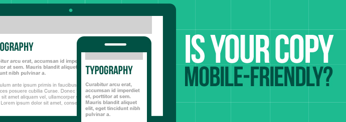
Get a responsive website.
The first and most crucial consideration for any budding m-commerce giant is developing a website that looks good and functions well on mobile devices. There are several different ways to approach this challenge, but we recommend using responsive web design techniques to ensure that your site can adapt smoothly to any screen size. A well-made responsive website will deliver a superb user experience across all devices, from PCs and laptops to smartphones and tablets, and it will save you from having to redirect mobile users to a mobile version of your site (e.g. m.example.com) that's separate from - and potentially inconsistent with - the site you're showing desktop users.
Creating an app specifically for mobile users may be a viable alternative to creating a responsive website, but while many businesses choose to explore the app option, this tactic does come with a number of drawbacks. For one thing, forcing mobile users to download an app may put some of them off, as downloading an app (even if it's free of charge) constitutes an extra commitment to your business that many consumers may not be willing to make. It makes sense for an ecommerce Goliath like Amazon to offer an app, as they have many committed customers who will enjoy having that extra convenience, but if your primary goal here is to entice new customers to your business then you're better off letting them discover and access your services via their phones' web browsers instead.
It's also worth noting that, according to searchenginewatch.com, mobile users make more purchases via browsers than via apps anyway. For these and other reasons, we would always recommend creating a responsive website for your business instead of targeting mobile customers with an app, at least in the first instance. The time to start thinking about apps is when you've already got a large base of customers who use their phones to access your business - at that point, perhaps they'll be happy to make that extra commitment in exchange for the added ease of an app.
Keep loading times to a bare minimum.
Nobody likes waiting an eternity for a webpage to load, but long loading times are particularly toxic when your users are on the go. Smartphone users want their content right away, and if you take too long to deliver it, a sizeable chunk of your traffic will bounce back to the search results and end up on a competitor's website instead. This infographic from KISSmetrics contains lots of interesting stats about load times and how they affect user engagement, but perhaps the most compelling titbit is this one:
"A 1-second delay in page response can result in a 7% reduction in conversions. If your ecommerce site is making $100,000 per day, a 1 second page delay could potentially cost you $2.5 million in lost sales every year."
Every second counts in the world of m-commerce, so make use of tools like Google's PageSpeed Insights to ensure that nothing is slowing your website down.
Make the payment process as simple as possible.
Once the user has finished browsing your website and filling their basket with all of your amazing products, you need to make it as easy as possible for them to complete the checkout process and finalise their order. Remember, convenience is key in the mobile market, and just as people won't want to wait ages for your site to finish loading, they might not have the time or the patience to register for an account and fill out loads of little boxes in order to finalise what may have been a spur-of-the-moment purchase in the first place.
So how can you make the last part of the purchasing process quick and painless for your site's users? The key here is payment integration; for example, many people have PayPal accounts, so if you can offer PayPal as one of your payment options you'll potentially save a lot of customers a lot of hassle.
If you allow (or indeed force) users to create an account with your business when they place an order, you may want to review that system before you attempt to conquer the mobile market. The idea with this sort of thing is usually to make life easier for repeat customers; by creating an account, these people are saved from having to enter their payment and delivery details anew each time they buy from you. Registering for an account is inconvenient in the short term because you have to fill out even more boxes, but it's more convenient in the long term because it means that future orders can be completed by simply entering a set of login details.
But here's the thing: the majority of mobile users probably aren't interested in that long-term convenience. They're not planning ahead, thinking of the precious seconds they'll save later if they take the time to register now - they just want to finish what they're doing as quickly as possible and get back to scrolling through Twitter. With this in mind, you may decide that it's better to scrap the 'Create an Account' step altogether, or at least offer an 'Express Checkout' option for users who aren't interested in registering.
Here's an example from the checkout page of www.henstuff.co.uk, an ecommerce website specialising in hen night accessories and party supplies. Registered users simply enter their login details; new customers can either create a new account ('Register Now') or checkout without creating an account ('Express Checkout').
Review and improve!
Websites are often very different when it comes to how users interact with them, and so it's unlikely that you'll nail the mobile shopping experience right away. That's OK, though - you just need to keep an eye on how people are interacting with your website and make ongoing improvements as necessary. Tools like Google Analytics are great for reviewing mobile use of your website and identifying areas that need work; for example, if a particular landing page has an abnormally high bounce rate on mobile devices specifically, you may want to reassess that page's design and alter it to ensure that your mobile users are getting the same great experience as your desktop visitors.
Need some help with your m-commerce efforts? The Designer Websites team are here to help! Here are some of the services we can provide:
Call 01446 339050 or click here to request a quote for your web development project.