Tag: web-design

Improve your category pages

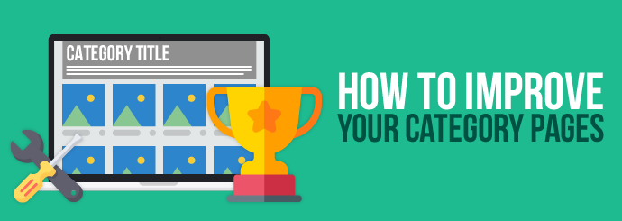
When you're trying to design a category page that will help drive sales, it's crucial to keep the customer's experience at the forefront of your mind. By navigating through your category pages, users should be able to easily find the products they're looking for and place their order.

At Designer Websites, we've been designing category pages for years, so we have a great understanding of what really works for our clients. We spoke to our lead designer, Jenna, and asked her what makes the perfect category page:

"We would always recommend that you use good images that are relevant and high quality, an interesting H1 heading that includes your page's keywords, and text that's short and relevant. Try to put your best-selling / most popular products towards the top of the page, and change them frequently so the pages look slightly different for returning customers."

Let's look at some of these different elements in more detail. You might find that some of these features are missing from your category pages, in which case, this might be a great opportunity to make some improvements.

1. Optimising Your Text

You want the text on your category pages to be concise, relevant and properly optimised for search engines. To achieve this, you should make sure that your category pages include a keyword-rich H1 heading and relevant information about your products.

Think of your category pages as a means for customers to get an overview of your products before making a purchase. You should try to describe the products or services on a category page using a few concise, easy-to-digest sentences, so users can quickly determine if they've chosen the right category.

In terms of SEO, you should try to include a range of keywords that are relevant to your category to increase the likelihood of your page ranking highly in the search results.

For example, if you own a cake business and you want to optimise the text on the category page for 'chocolate cakes' you might target keywords like, 'best chocolate cakes', 'chocolate sponge cakes' and 'chocolate birthday cakes'. You might find it beneficial to keep the text under the H1 (that users will see first) short but include more keyword-rich text towards the bottom of the page to improve your chance of ranking.

If your site is optimised effectively, someone searching for a 'chocolate birthday cake' should be taken to your category page where they can view all the chocolate cakes you offer. Someone searching more specifically for a 'vegan chocolate cake' might be taken straight to a product page instead, where they can read a detailed description of the vegan chocolate cake you supply and place their order.

2. High-Quality Images

When your business operates through an ecommerce website, customers are deprived of that real-life touch, feel and browse experience. It's important to use relevant, high-quality images on your category and product pages to really bring your products to life!

One thing that online shopping allows for is a comparison between brands. Your customers might be considering products from several different competitor sites as well as yours, so you want to provide the best possible experience you can and secure the sale.

Going back to our cake business example, imagine a scenario where a customer is looking for a great chocolate birthday cake. They're considering three or four local cake suppliers, including you. If your chocolate cake category page is filled with high-quality photos of truly tempting chocolate cakes, and your competitors have a few low-resolution images to compare to, you'll (probably) win the sale every time!

3. Featured Products

Highlighting products on your category page is a great way to boost sales. Moving products towards the top of the category page and adding a bold border or an eye-catching sticker is a great way to draw the user's attention towards the products you want them to buy. It also provides users with a sense that they are getting the best option or deal available.

Even if users only spend a few minutes on your category page before moving elsewhere on your site, the emboldened products are likely to stick in their minds. They might even decide to come back for a second look if they feel they've missed out on a good deal.

With that in mind, you should use the featured products section of your category page to focus on best-selling products, products included in special offers, and products that you want to shift quickly.

Keep your category pages fresh and engaging by rotating your featured products regularly. That way, returning visitors won't be greeted with the same products over and over again.

4. Filters

If your business boasts an extensive portfolio of products, you might want to consider adding filters to your category page so users can quickly find the items they need. Filters are a popular feature of most ecommerce websites because they break down categories into smaller, niche groups of products that more relevant to the user.

Let's say you own a shoe store and a customer visits your site hoping to buy a new pair of black high heels in a size six. They're going to a party at the weekend and (as usual) they've left it until the last minute to organise their outfit. When they land on your site, they see hundreds of different types of shoes organised into categories by style.

Luckily, your 'high heels' category page allows them to filter the shoes by size and colour. This instantly refines their search so they can browse all the pairs of shoes that fit their criteria. They spot a fabulous pair and place their order - success! That's one more happy customer who might recommend your shoe store to a friend or leave a positive review.

5. Search Box

No matter how well structured your site navigation is, there will always be some users who prefer to head directly to specific products. That's where the search box comes in handy.

It's important that your database is organised so that the right products show up for the right queries - you wouldn't want a user searching for 'black heels in size six' to be faced with an array of blue trainers, would you?

Data from the search box can also provide you with insights into the products that are most frequently searched for by your customers. Perhaps they're struggling to find the products they're looking for; in which case you could tweak your site navigation so frequently-searched products are easier to find.

Alternatively, frequent searches could indicate that a certain product is very popular with your customers. In this case, you might decide to run a special offer or add it to your 'featured products' section to boost sales. Either way, having a search box on your category page will benefit you and your customers.

If your ecommerce website needs an overhaul, Designer Websites can help. Our experienced team of designers, developers and SEO specialists understand what websites need to succeed - contact us now to discuss your requirements!

Get a Free Ecommerce Website Quote >>

web design, web designers, SEO experts

Part of the ever-expanding Greensquares family, DeckPlus is the newest brand to hit the UK composite decking market.

Offering a wide selection of decking products – ranging from premium, capped composite decking to affordable, eco-friendly hollow deck boards – the company were looking to create a fresh site that reflected this exciting new brand.

After laying down the gauntlet to our web designers, we quickly got to work creating a fresh, new site for his fresh, new brand.


A One-Stop-Shop

Combining their existing TimberTech products with their all-new DeckPlus branded boards, the desired outcome of the project was conceptualised as an online amalgamation of decking solutions, providing the ultimate one-stop-shop for decking design.

The result was DeckPlus.co.uk – a true home for all things composite decking.

The DeckPlus website provides a welcome online home for the DeckPlus brand, while also acting as a worthy second-home for the company’s TimberTech range, in addition to the pre-existing TimberTech site.


A Modern Site for Modern Products

As part of the brief, we were asked to provide DeckPlus with a site that reflects their modern products.

Our team of expert designers were more than capable of living up to the challenge and were eager to create a site that accurately reflects the new brand’s contemporary flair, while also providing the necessary capabilities of an effective decking site.

Logically laid out in a prioritised order, each webpage is packed with all the user-friendly functionality you would expect from a professional site, blending helpful information with simple processes and easy navigation.

Topped off with a clean, crisp oceanic colour scheme, the aesthetic appearance of the site is modern yet inherently easy on the eye, with an occasional infusion of orange-brown as a tip of the cap to the company logo.


User-Friendly Functionality

From a functionality standpoint, we created an uncomplicated layout that provides seamless usability on all devices, working just as well on a mobile or tablet as it does on a laptop or desktop.

For further ease of use, the site is specifically designed to allow you to refine your decking search by a variety of chosen criteria: from colour and price to decking type and product range.

What’s more, the simple navigation bar positioned at the top of each page allows you to effortlessly transition from one page to the next, without the hassle or fuss of searching high and low for the relevant tab.

The site also features a company blog page to keep users up to date with all the latest goings-on in the company, as well as the wonderful world of outdoor decking.


Optimised Web Copy

DeckPlus offers a myriad of stunning designs and a variety of decking materials at a range of prices to suit all budgets. As a result, the site houses a vast online catalogue of these products and sub-categories, all requiring unique copy for each and every page.

This necessitated bespoke web copy for the entire site. Each page needed captivating copy that still included the all-important fundamentals: the essential top-line information, supplementing by the detailed nitty-gritty, before rounding off with the bottom line of price.

Meanwhile, each page was also painstakingly optimised by our SEO experts to give the site a running start when it was made live. This has helped to ensure the correct pages rank for the relevant industry terms and product descriptors in the search engine results, ultimately boosting the likelihood of conversions.


For more information on our web design and copywriting services, why not get in touch today? Call now on 01446 339050 or click the button below to get a quote online now.

Get a Quote

SunSpaces is a well-established part of the Greensquares family of brands, offering a range of high-quality garden rooms, verandas and awnings to help residential and commercial property owners make the most of their outdoor living spaces. SunSpaces stand out from their competitors because their products can be customised to suit every client’s unique requirements and preferences.

We were recently asked to re-design and update the SunSpaces website. Many elements of the site including the colour scheme, page layout and menus have been refreshed by our web designers to create a contemporary, professional-looking new website.  

You will notice that the new website includes many products that have always been a part of the SunSpaces brand, like the Aspire garden rooms and Compact awnings. However, in addition to these longstanding favourites, their new website incorporates a variety of new products and accessories, such as the Avant-Garde and Ultra garden rooms.

The new SunSpaces website is packed with features that make it enjoyable and easy to use. Our development team used the very latest coding techniques and schema tags to build a bespoke, responsive website that stands out in the search results and works seamlessly on both desktop and mobile devices.

We included a content management system (CMS) so staff can control products and prices, categories, photo galleries, banners, landing pages, performance reports and more. We integrated Salesforce so that staff can easily manage quotes and follow up requests.

We also added intelligent landing page control and advertisement tracking so that advertising campaigns can be monitored and altered effortlessly. The new site is also integrated with conversion tracking so that its performance is continually recorded and easy to assess whenever necessary.

With these new features and a modern re-design, we are confident that the SunSpaces team and future SunSpaces customers will take pleasure in using the site. We have been able to create a new website for SunSpaces without compromising any of the features that made the old site such a success!

You can visit the new SunSpaces website here: https://www.sunspaces.co.uk/

If you’re looking for a professional website for your business, look no further. Get in touch with the team here at Designer Websites for a free, no-obligation web design quote.

Contact Us >

RJ Funerals Website

Robert D. Johnson Funeral Directors are an independent funeral service based in Barry, Vale of Glamorgan. This family-run business specialises in bespoke, flexible funeral services for families who are looking to make arrangements after the passing of a loved one. With extensive experience in funeral care, they ensure every family receives the service they’ve envisioned for their dearly departed – while alleviating them of the stress of organising the funeral arrangements during their period of grief.

Robert D. Johnson Funeral Directors offer the following funeral packages:

As an independent business, Robert D. Johnson offer a caring, personal service that large chains are sometimes unable to provide. Staff are selected on the basis of their professionalism and caring approach to their work.

How Did We Help Them?

We have created a user-friendly brochure website for Robert D. Johnson Funeral Directors. The new design is professional and befitting of the industry in which this client operates, and the website interface is very easy for users to navigate. Visit www.rjfunerals.co.uk to take a look at our work.

We provided:

  • Responsive Website Design – The RJ Funerals website functions well across all screen sizes whilst maintaining its sophisticated look. Regardless of the device used to access the website, the pages of the website maintain their look and ease of navigation.

  • Search Engine Optimisation – Every page on the new RJ Funerals website features high-quality content which is relevant to the user, effective in communicating the services offered, and carefully optimised for high Google rankings.

Do you need a bespoke, professional website to showcase your business and the services you offer? If so, get in touch with Designer Websites for a free, no-obligation quote.

Get a Web Design Quote >

Ecommerce Website Design Ideas

When you're trying to succeed in the world of ecommerce, there are lots of different factors to consider. Nowadays, most online shoppers expect ecommerce websites to meet each of the following criteria:

  • Secure checkout system
  • Appealing, mobile-friendly design
  • Minimal loading times
  • User-friendly site navigation
  • Extensive product information (so that people know exactly what they're buying)
  • Competitive prices
  • Positive feedback from other customers
  • Ability to contact the seller with ease

Consumer trust is key to the success of any ecommerce website, and you will probably need to tick all of the above boxes in order to earn the trust of the average online shopper in this day and age.

With this in mind, here are three helpful ecommerce website design ideas from the ecommerce experts here at Designer Websites:

Use engaging, good-quality product images.

Most people won't purchase something online unless they're certain of what they're paying for. Detailed product descriptions are important, but a picture is worth a thousand words, and a few good images will generally sell your product a lot more effectively than a few paragraphs of text.

Both quality and quantity are important here. You need detailed images that make your items look enticing, but you should also try to offer a variety of images for each product. Try to cover all bases: one no-frills image that clearly shows what the product looks like; one or two photos of the product in use; a picture to show what the product looks like in its packaging, and another to show what's actually inside the box. You get the idea - your product images should aim to answer every question the average customer might ask.

Of course, you should also ensure that the images on your website aren’t so large that they slow the whole page down. Loading speed is a critical issue for Internet users these days, and even an extra second or two can have a disastrous impact on your website’s conversion rate, so make sure those beautiful images are optimised for a smooth, speedy browsing experience!

Put lots of emphasis on customer reviews.

We all seek approval from other people, and this tendency can be clearly seen in the behaviour of online shoppers: by and large, we're far more likely to buy something if several other people say they did the same and had a good experience.

For this reason, you not only need to gather reviews from your satisfied customers, you need to put those reviews right where everyone will see them. Your ecommerce website design should ensure that every potential customer sees all the 5-star ratings and positive comments that your other customers have left. It should also be clear how many people have reviewed each product, since a 5-star average rating is a lot more persuasive if multiple people have given the product full marks.

Shoppers see positive reviews as seals of approval - they have a hugely reassuring effect on the potential buyer, so make sure those ratings and recommendations aren't buried way down at the bottom of the page.

Make it easy for users to find what they're looking for.

The modern Internet user is an impatient creature, and the more barriers you put between them and what they're looking for, the more likely it becomes that they'll leave your website and shop with one of your competitors instead. As we mentioned before, it's important to ensure that your pages load quickly, but it's just as important to make the journey from one page to the next as seamless as possible.

This can be achieved in a number of different ways:

  • Make sure your website's search function works properly, and ensure that the search bar is easy to find no matter what page the user is on

  • List 'related products' (or similar) on your product pages. That way, if the user decides that the product they're looking at isn't quite what they need, it's easy for them to find a suitable alternative.

  • Put important information - your delivery options, your returns policy, and so on - somewhere that's reasonably easy to spot so users don't waste time trying to find it.

  • When designing your site hierarchy (i.e. your categories and sub-categories), put yourself in the shoes of your average user and try to come up with a sensible structure that's easy to navigate even if you've never seen it before.

  • Make your homepage as helpful as possible. It may be tempting to simply fill your homepage with the products you're most keen to sell, but this may not be best for the user. Again, you should endeavour to put yourself in their shoes: if someone arrives on your homepage, are they looking for a specific product or piece of information, or are they just browsing for ideas? Do they want to know about your company, or do they want to see the newest additions to your range?

Essentially, your aim should be to minimise the number of clicks / actions the user has to perform in order to achieve their goal.

If you need a bespoke ecommerce website designed by professionals, we at Designer Websites are the people to call. Request an ecommerce quote here!