Last month, Google issued an ultimatum to webmasters the world over: make your websites mobile-friendly before April 21, 2015, or we'll stop showing you in our mobile search results. You can read the official announcement on Google's blog; search experts have nicknamed the promised algorithm change "the mobile SEO-pocalypse", and with that mid-April deadline now less than a month away, innumerable business owners are scrambling to make their sites look good on smaller screens so as to avoid losing their Google traffic.
Now, we're not here today to give you responsive design hints - the internet is already packed with articles explaining how to make your website 'mobile-friendly', and if you want our help, you can request a quotation here. However, we have noticed one potential issue that few others seem to pick up on, and it concerns your website's text.
You see, when web designers create a new design for an old website, they will often just copy and paste the old site's copy into the new design. This approach can create some problems for the end user, even if the information within the text is up-to-date. Here's a fictional example:
- Alice is an interior designer who owns her own business. She has a brochure website - let's call it aliceinteriors.com - that she uses to drive enquiries. Would-be customers fill in a contact form on the website, and Alice calls them up to discuss their requirements, quote prices, and so forth.
- Alice has heard about Google's upcoming algorithm change, and she wants to make her website mobile-friendly before April 21 to make sure she doesn't lose any business. She hires a local web design company to create a new responsive design and optimise the site for mobile users.
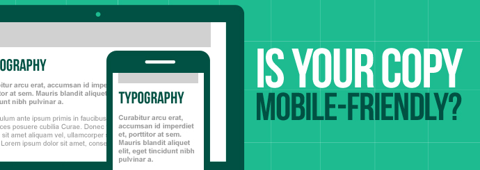
- A responsive website is effectively several different website designs in one, and aliceinteriors.com will now look different depending on whether Alice views it on a PC or on a smartphone. For instance, the site menu will likely be represented by the ubiquitous hamburger icon on smaller screens, and certain elements of each page may appear in different positions across different devices.
- While looking at the mobile version of her website, Alice notices an issue: the text on her homepage tells users to "Fill in the form on the right", but in the mobile view, Alice's all-important enquiry form is placed directly below the text in question.
This imagined scenario is just one example. Broadly speaking, any written reference to site layout ("Click on the link below", "Select an option from the menu above", etc.) becomes problematic - if not outright misleading - when placed within a responsive design. Unless you and your web designer can find a way to ensure that certain items remain static across all views, it may be better to remove any such phrases entirely and find other ways to draw attention to your website's key elements.
Either way, there's an important lesson to be learned here: when optimising your website for mobile users, be sure to read through your site's text in each different view to make sure that you aren't confusing people with smartphones!