There was a time when people could only access the internet on a PC, but those days are well and truly behind us. In this day and age, the humble desktop computer is just one of many, many different ways in which we can get online, and your customers are now just as likely to see your website on a mobile phone as on a proper computer.
This could well be a problem for you. Just because your company's website looks great and functions perfectly on a PC doesn't mean that it will work just as well on a smartphone; in fact, if the site wasn't made with mobile devices in mind, there's a very strong chance that it will be next to unusable. Smartphone usage is going up every day, so simply ignoring your mobile traffic won't be a viable option for long - you'll either have to find a way to give those visitors a good user experience, or face the fact that you're going to lose them to a competitor who was prepared to make that extra effort.
Once you've decided to make the leap to mobile, there's another big decision to make: do you create an app for your business, or plump for a responsive website that will look good on screens of any size? This is a hotly-debated topic, and we at Designer Websites couldn't resist throwing in our 2p. Here are some pros and cons:
Mobile App
Pros:
- Stays with the user, remaining on their device after download
- Designed specifically for mobile - no need to change the desktop version of your site
- Can incorporate 'push notifications' to keep the user coming back
Cons:
- Download required (demands more commitment from the user)
- May be hard to find in the App Store (what does your business share its name with?)
- Your website will still look poor on mobile devices
- No search engine presence
Responsive Website
Pros:
- Attractive, user-friendly, and consistent across all devices
- SEO-friendly (your business is more likely to appear in search results)
- No download or commitment required from user (unlike apps)
Cons:
- Less permanent than an app - doesn't stay with the user
- Requires a redesign of your current site
So which is the right choice? To be honest, it depends on your business and what you're trying to achieve. For our part, though, we'd always recommend a responsive site over an app, simply because it ensures that all users are seeing the same information and getting a consistent user experience. Click here to learn more about responsive design, or click here to get a quote for a responsive site of your own.
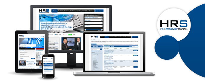
Hyper Recruitment Solutions is the recruitment business that is co-owned by 2012 Apprentice winner Ricky Martin and business magnate Lord Alan Sugar. HRS specialise in science and technology; they help employers from within these sectors to recruit bright new talent, and they enable talented jobseekers to find rewarding work in such fields as biotechnology, pharmacy, and engineering.
We have been working with Ricky Martin and HRS ever since the business was founded - the company's website, www.hyperec.com, was designed and developed by the team here at Designer Websites. A few weeks ago, Ricky asked us to make his website more mobile-friendly; like many of our clients, he had decided that it was time to go responsive.
The new and improved HRS website is now live, and we hope that Ricky and Lord Sugar are as proud of it as we are. The site is now fully responsive, which means that it displays differently on different-sized screens. This makes it much easier to navigate on smartphones, tablets, and other mobile devices; with more and more people swapping their desktop PCs for iPads and Androids, this is a crucial consideration, and we are confident that the HRS site's many mobile users will be more than satisfied with its new responsive design.
Browse HRS Science Jobs > Get a Web Design Quote >
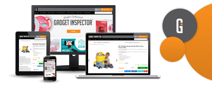
We're always busy here at DW, but things have been particularly hectic over the past couple of weeks. We've been hard at work on a new, responsive design for the Gadget Inspector website, and we're pleased to announce that it's finally complete!
For the uninitiated, Gadget Inspector is an online gadget store that's been doing roaring trade for the past three years. These self-professed 'gadget enthusiasts' decided that their website was beginning to look a little bit dated, and so they come to us for help - after all, if you're selling cutting-edge gadgetry, you ought to have a cutting-edge website to go with it.
And that's exactly what we've provided: a cutting-edge website that's perfectly-suited to Gadget Inspector's weird and wonderful product range! The company's new site is packed with eye-catching lifestyle images, and each product page is packed with information about the relevant item. Oh, and the fully responsive design means that Gadget Inspector looks great now matter what device you're viewing it on!
We're biased, of course, but we really think that the new and improved gadgetinspector.co.uk is the perfect place to shop for gadgets and gifts (which is pretty handy, given that Christmas is just around the corner!)
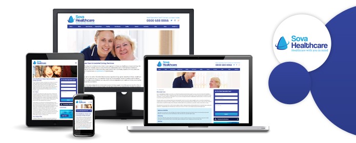
Sova Healthcare provide bespoke home care services to elderly and vulnerable individuals in Yorkshire and Leicestershire. With two offices in two separate parts of the country, the company was beginning to outgrow its rather basic website, and that's why Sova got in touch with the Designer Websites team.
We used a number of different strategies to update Sova Healthcare's online presence. The most striking difference between the new site and the old site is the responsive design; given the current trend towards mobile phone usage, most of our recent clients have opted to go responsive, and Sova were no exception. Where the old site was somewhat difficult to navigate on a smaller screen, the new site looks great and functions perfectly on any device, from desktop PCs to smartphones and tablets.
Home care is obviously a sensitive topic for many people, particularly the type of people who are likely to visit the Sova website. With this in mind, we collaborated with Sova to ensure that every element of their new site painted the company as a compassionate and understanding care provider with a wealth of experience. This is reflected in every aspect of the finished website, from the copy to the choice of images.
With streamlined navigation and a friendly, welcoming design, Sova Healthcare's new website will make it as easy as possible for clients to arrange healthcare for their loved ones. If you want to visit the new site, you'll find it at www.sovahealthcare.co.uk.
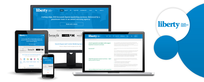
With offices in both Cardiff and London, Liberty Marketing are an award-winning agency with a great track record. They offer a range of digital marketing services, from copywriting and search engine optimisation to social media management and pay-per-click advertising. They've helped hundreds of businesses - large and small - to find their feet online, and their brand new website will surely help them to reach even more clients.
The new Liberty website went live yesterday, and it's another great example of our talent for responsive web design. If you'd like to take a look, the URL is www.libertymarketing.co.uk - here are some of the improvements that we've made:
- Responsive design for better appearance and functionality on mobile devices
- Simple, straightforward navigation, making it easy for users to find the service they need
- Crisp, modern look that stays true to the company's established brand image
- 'Our Thoughts' section, containing Liberty's latest blogs and social media posts
With mobile internet use increasing all the time, it's now more important than ever to have a responsive website for your business. Click here to request a free, no-obligation quote for your new site.